Field group form element
Use the Group accordion and the Field group form elements to group fields on your Component form. These fields are purely for the purpose of making your Component forms easier to use through layout.
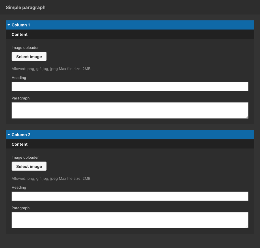
The example below shows the Group accordion (in blue) and the Field group (in black) being used to organize the layout of a form with many fields.

Locating the field group form element
To find the Field group form element:
- Navigate to a component
- Click the + button on the Component form builder
- Within the Fields tab, look for the field group form element.

The Field group form element includes the following fields:
Title field
- Provide a name for the form element. Important: This will be displayed in your component form.
Field settings
- Show heading - When toggled on, the field group heading is shown in the component edit form
- Enable padding - When toggled on, padding is added around the fields within the field group
- Column count - You can layout the component form fields in columns
- Undefined - Expand the column to the available width, this is the default
- 1,2,3,4 - Set the numbered column to the number of fields to layout your fields
- Breakpoint icon - Visually display a breakpoint indicator next to the fields within the field group. This is useful for fields that are specific to a breakpoint. Note: Displaying a breakpoint indicator has no functional use.

