Using the layout canvas preview
The Layout canvas includes a preview feature. You can use this to see what a layout will look like on the website. The Layout canvas preview allows you to see the layout at different responsive breakpoints, at different widths, against different background colors and with responsive grid guides overlaid.
The Layout canvas preview is available when creating Components, Content templates and Master templates. It's not available when creating Menu templates, View template or content nodes.
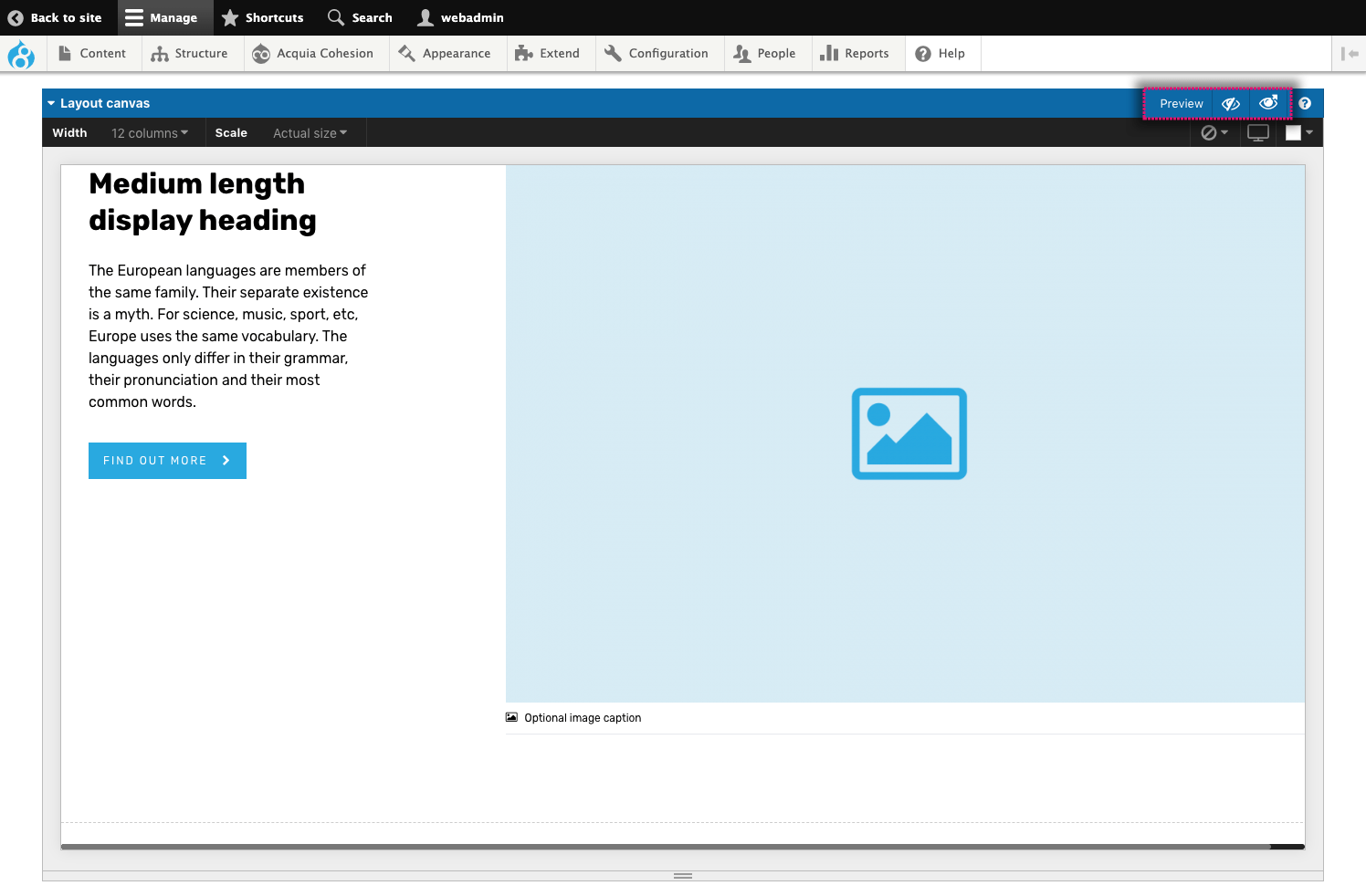
Access the layout canvas preview
To access the Layout canvas preview:
- Create or edit a Component, Content template or Master template
- Click on a Preview icon in the top right of the Layout canvas. Click the left icon to open the preview in-place or the right icon to open the preview in a new window
- If opened in-place, the Layout canvas will switch to a preview of the layout.
Preview the layout at different widths
A component or template maybe designed to display at a width less than the full width of the website. In this case, you can set the width of the preview so that it is more representative of the intended output width.
To set the width of the preview:
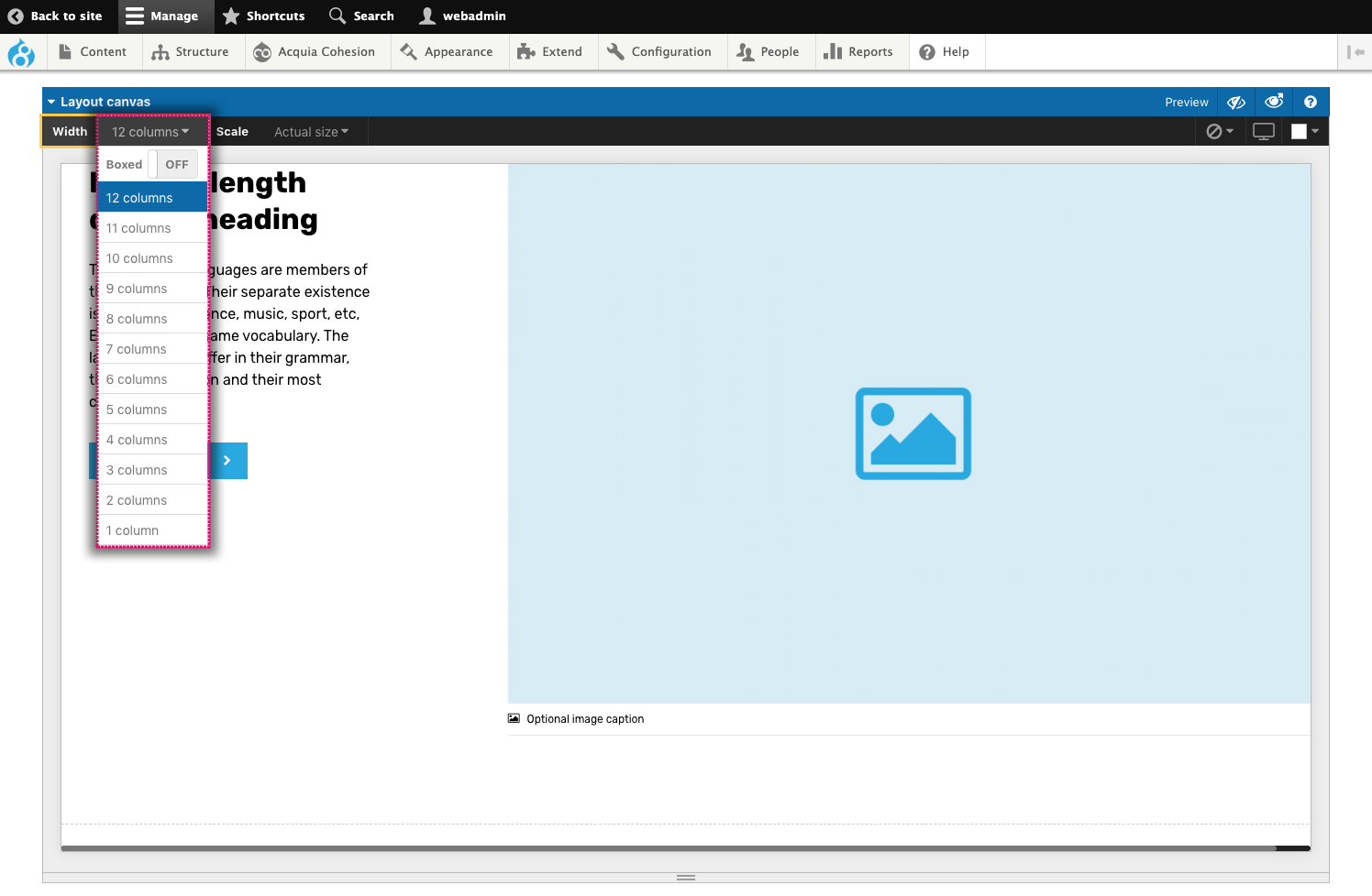
- Click on the Width menu in the top left of the Layout canvas
- Select the width to display the preview
- If you want to restrict the width to the boxed grid, click on the Boxed width toggle.
Set the preview scale
You can set the preview to show the layout at 'Actual size' or Auto fit in the available space. This is useful if you are using the preview on a device with a screen that is smaller than the actual size of the component or template.
To set the scale of the preview:
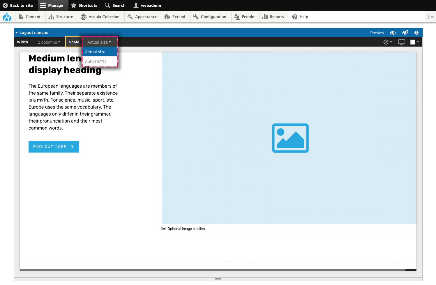
- Click on the Scale menu in the top left of the preview
- Select Actual size to preview the layout at it's actual size (100%)
- Select Auto to set the preview to automatically scale to fit within the preview area. The scale used is shown as a percentage.
View the layout at different responsive breakpoints
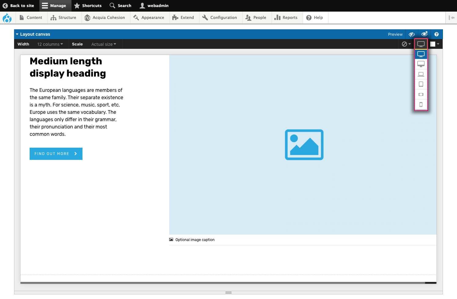
You can preview your layout at each of the responsive breakpoints set in the Responsive grid.
To view the layout at different breakpoints:
- Click on the Breakpoint menu in the top right of the preview
- Select the breakpoint to preview.
Show the responsive grid guides
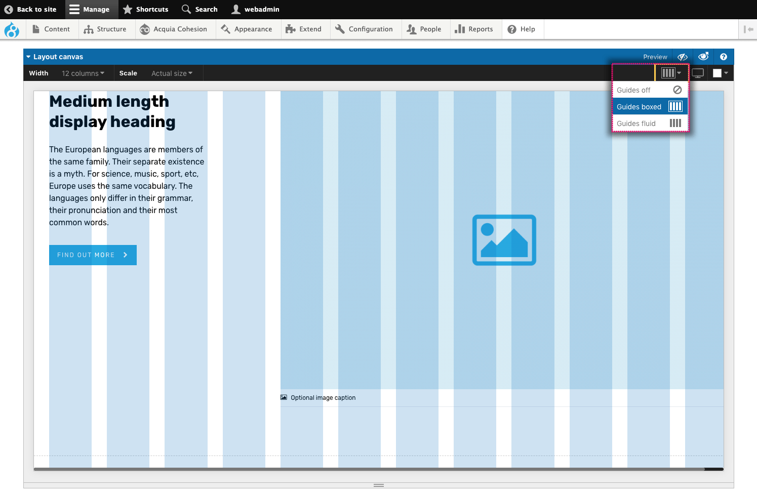
You can turn on guides to display how the layout aligns with the responsive grid columns.
To turn on the guides:
- Click on the Guides menu in the top right of the preview
- Select Guides boxed to display the guides within a boxed width. This is useful for boxed with layouts
- Select Guides fluid to display the guides within a fluid width. This is useful for fluid width layouts.
Set the background color of the preview
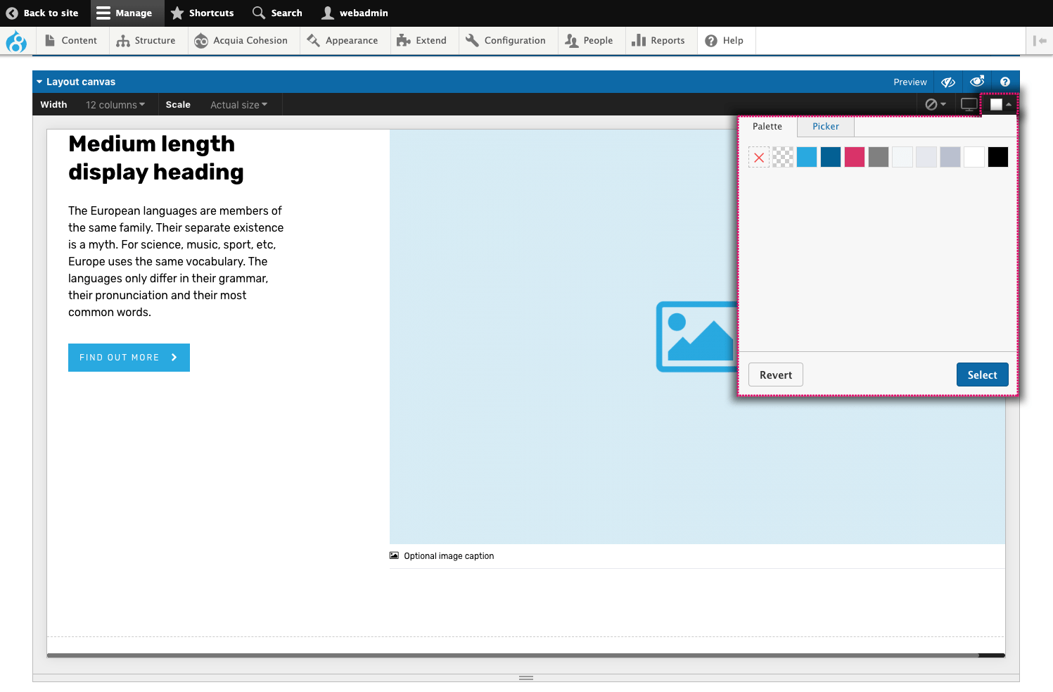
A component or template maybe design to display on a background color that is different from white.
To set the preview background color:
- Click on the Color menu in the top right of the preview
- Select the color to set as the preview background.
Setting preview content
The preview will use the content added to the elements within the layout.
Setting preview content when using tokens
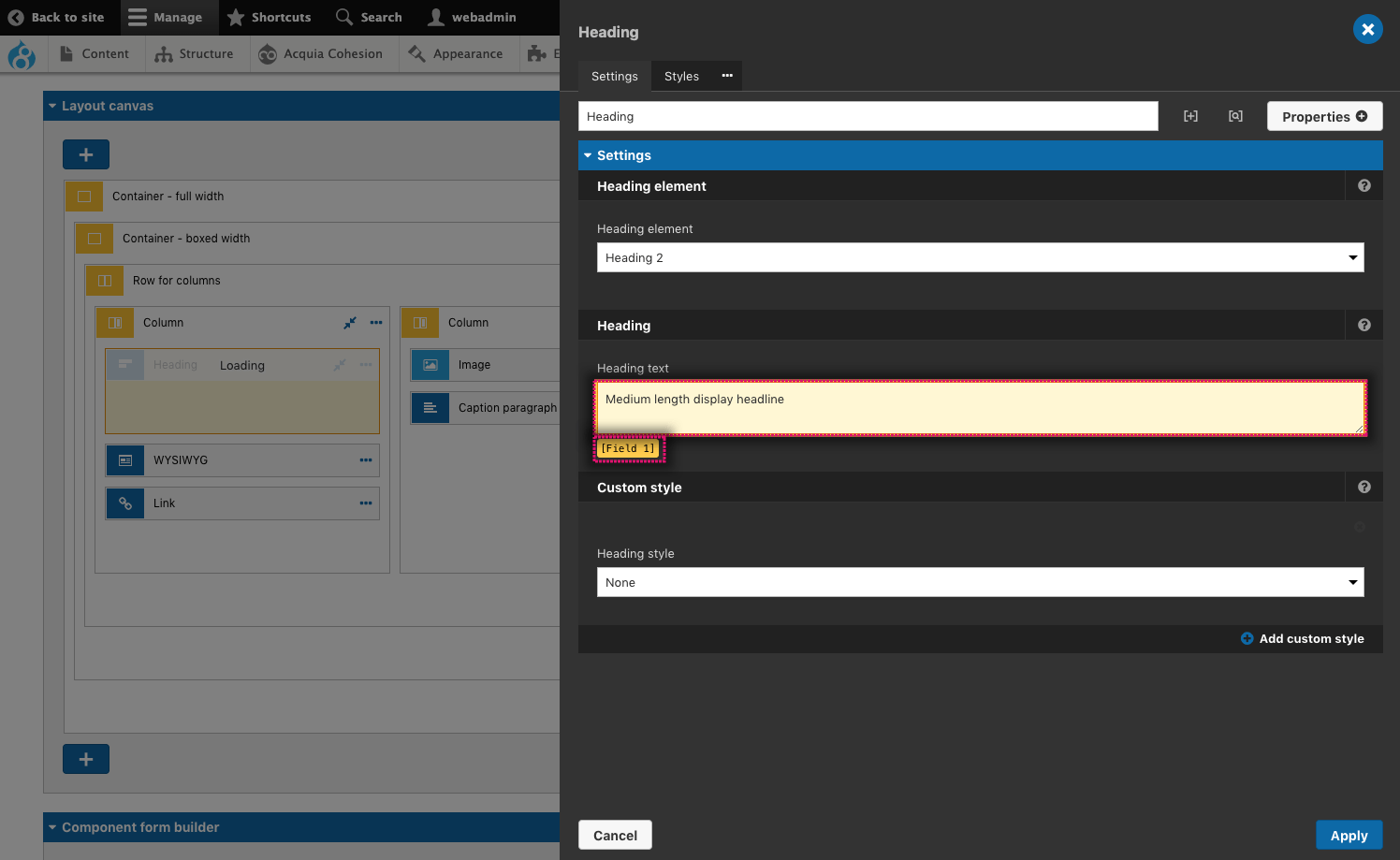
When a Component field token or Drupal token is added to an Element field, the preview will use the content added to the field while it is not in variable mode. The token will be displayed below the field as a yellow highlight. The field will turn pale yellow to indicate that the content is for preview purposes only.
Setting component field default content as preview content
When creating components, if no content has been added to the element fields, the preview will use the content set as Default content within the component form fields. This is useful for managing both default content and preview content from the same place.
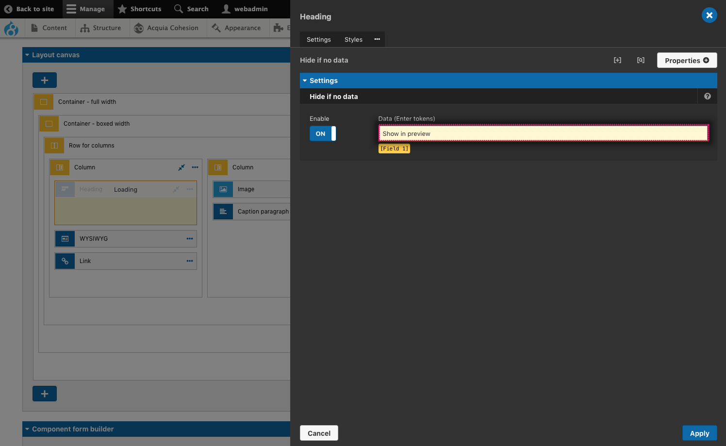
Showing preview content when 'Hide if no data' is used
If content is missing from your preview, it is probably being hidden by the 'Hide if no data' system. Follow the steps below to ensure all content is displayed within your preview.
You can set an element to be hidden if a specific token has no data within it. For more information, see Hide element if no data. When using 'Hide if no data' the preview will not show the element as it is unaware that there is any data available.
To ensure elements are displayed within the preview when 'Hide if no data' is applied:
- Open the element settings
- Navigate to Hide if no data
- Ensure you are not in variable mode. Your token should be displayed as a yellow highlight below the field
- Enter some text in the Hide if no data field. You can add any text in the field as its only telling the field that it has some data for the purpose of the preview.
Displaying Drupal fields and regions within the preview
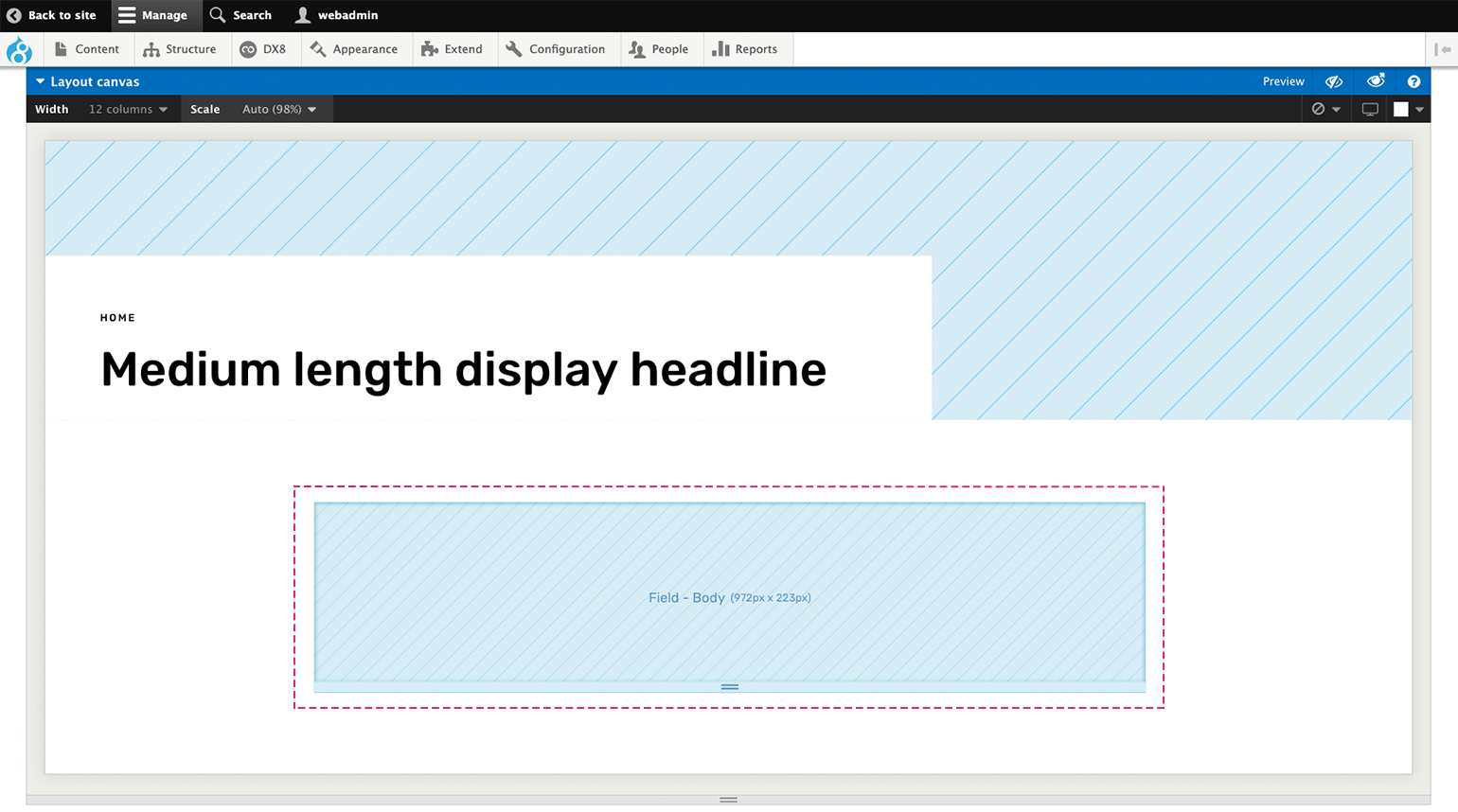
When creating Master templates and Content templates and using Drupal fields or Regions within them, the preview has no element or data to show. For this reason, a placeholder is added to the preview to show where the field will render. This is represented by a light blue box.
Setting the size of the placeholder
The field within your template may render a small element or a large element. For this reason, you can set the size of the placeholder to be more representative of the rendered output of the field. To set the placeholder size, click and drag the handle at the base of the placeholder.
