Group accordion form element
Use the Group accordion and the Field group form elements to group fields on your Component form. These fields are purely for the purpose of making your Component forms easier to use through layout.
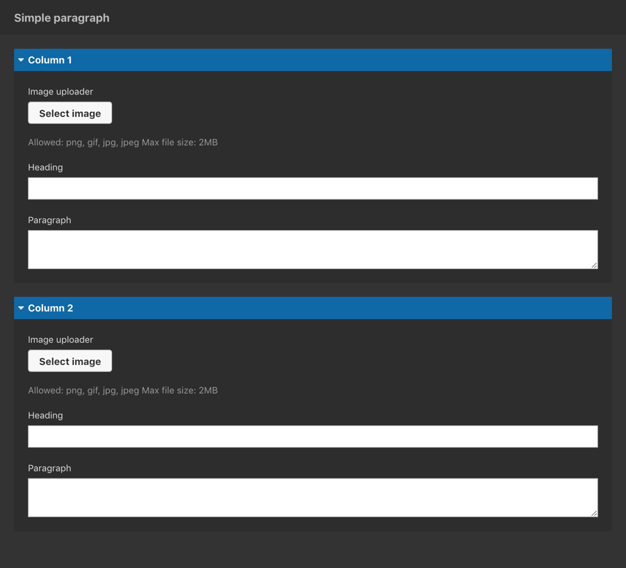
The example below shows the Group accordion (in blue) and the Field group (in black) being used to organize the layout of a form with many fields.

Locating the group accordion form element
To find the Group accordion form element:
- Navigate to a component
- Click the + button on the Component form builder
- Within the Fields tab, look for the Group form element.

The Group accordion form element includes the following fields:
Title field
- Provide a name for the form element. Important: This will be displayed in your component form.
Default state
- Open - Sets the default state of the accordion to open when toggled on.

