
Understanding the responsive grid preview
The responsive grid user interface provides a visual preview of your grid for each device width.
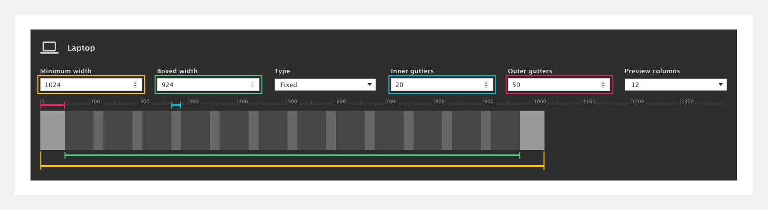
What the preview shows
- The outer gutters (highlighted in pink)
- The inner gutters (highlighted in blue)
- The grid columns (this is the space between the gutters)
- The minimum width (highlighted in gold)
- The boxed width (highlighted in green) What is boxed width?
Preview width
The preview width is fixed to the minimum width. When viewing the preview on smaller devices, the preview will scroll horizontally because the width is fixed. This allows you to preview the width of the Desktop settings even on a mobile device.
Preview columns
You can also set the number of columns displayed in the preview using the Preview columns dropdown. This is to help you see what the grid will look like with different numbers of columns. This is useful on narrower breakpoints where 12 columns with inner gutters doesn't actually fit within the device width. The preview columns are only a visual aid and do not effect the actual number of columns in your grid which is always 12.