Updating the Sections UIKit text color styles
The UIKit includes text styling for different colored backgrounds. These include styles for light, dark and colored backgrounds. Text themes are applied automatically when a color is selected for the background color of a component. When a color isn't selected, the text styling can be applied manually by content authors.
Updating the text color styles
The text color styles are Custom styles (classes). To update them, navigate to Site Studio > Styles > Custom styles and open the Generic category. Within this category you'll find the following text color styles:
- Text color colored background (.coh-style-text-color-colored-background)
- Text color dark background (.coh-style-text-color-dark-background)
- Text color light background (.coh-style-text-color-light-background)
- Card text colored background (.coh-style-card-text-colored-background)
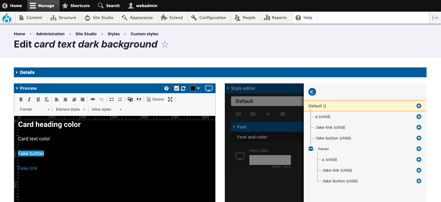
- Card text dark background (.coh-style-card-text-dark-background)
- Card text light background (.coh-style-card-text-light-background)
Important: There are separate text color styles for the Card components. This is to provide more specific styling options for elements contained within the card components.
To update the text color styles, use the Style tree to select the different elements within the style and modify their colors.


