
UIKit card components
The UIKit includes a range or card components to display blocks of content within layout components. The information on this page highlights the key shared features you should understand before modifying the components.
Layout canvas elements
The cards each include different elements that make up their layout and content. They also share common elements and a common approach to the main elements. These are:
Card heading and link elements
Most of the cards include a heading element set to H3. Those that are links include a link element within the heading element. This is important for accessibility as the heading becomes the link read by screen readers.
The link element includes an :after pseudo element. This is set to position:absolute and top, bottom, left and right to 0. This makes the pseudo element fill the width and height of the card. This is important for usability as the clickable area of the card takes up the whole card.
Fake link
Some of the cards include a 'Fake link.' This is a span element that visually looks like a link but is not a link element. This provides a visual indicator to sighted users that the card is a link. The text used within the Fake link is also used as an aria label on the Link element. This allows screen readers to add the fake link text to the end of the link as a call to action. For example "Heading of card - Find out more." The Fake link text is applied as an attribute on the Link element within the Markup tab.
Card content order
Many of the cards include both text and image content, for example, the Content card. You will notice on the Layout canvas for these cards that the image is placed after the text even if it displays before the text visually. This is important for accessibility as it ensures the image has the context of the card heading.
Component form fields
Each card component has different settings that are specific to the card type. They also have settings that are the same across most cards. If you understand how one card is built, you can quickly understand how all the cards are built. Most of the cards include the following approaches and settings.
Card background color and automatic text color
Content authors can change the background color of cards using a Color picker field. When they select a color, a corresponding CSS class (custom style) is applied to the card to style the text within it. For example, if Black is selected as the background color, a custom style is applied that styles the text white. This ensures the text contrasts with the background color.
This is achieved using hidden fields that are conditionally applied to the card when a background color is selected. To understand more:
- Open the Feature card component and scroll to the Component form builder.
- Then expand the Layout and style tab and then expand the Color - Conditional fields area. Within this, you will find three Hidden fields.
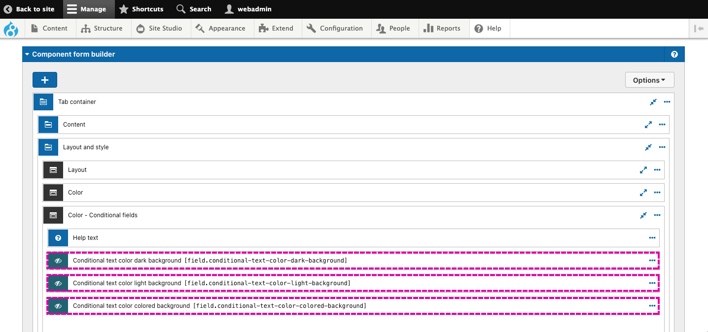
Each of the hidden fields will apply a different custom style to the card. The hidden field applied depends on the background color selected and if it has been tagged with Light, Dark, or Color.
This is achieved using a condition on the Hidden field. To understand more, open the settings for the first hidden field. Within the settings you will see the value is a CSS class - coh-style-card-text-dark-background. This will apply a style that makes the text light, to contrast with a dark background if selected.
Below this, within the Visibility section you will see a condition that must be true for the hidden field value to be applied. This is [field.background-color] tags include 'Dark'. If we translate this condition, it says "The value of the field 'background color' must be tagged with Dark." If this is true, the hidden field value will be applied.
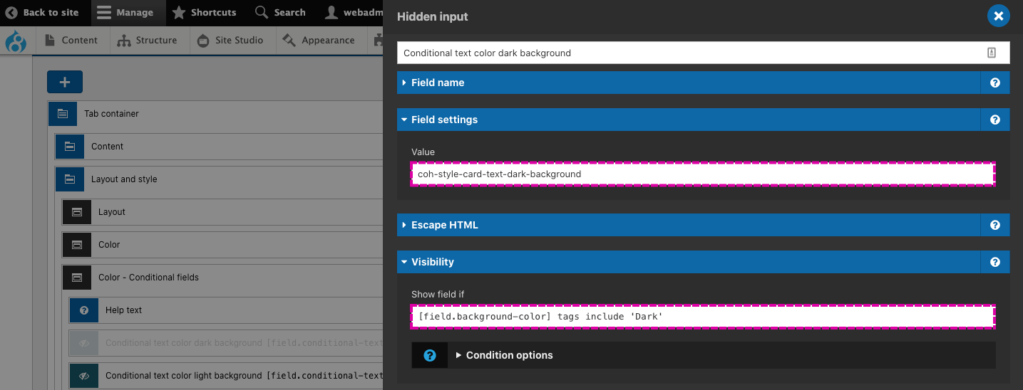
The same logic applies to all three hidden fields. Each hidden field applies a different custom style when their visibility condition is true.
Card background color and manual text color
Suppose a content author selects no background color, transparent background color, or a color that hasn't been tagged with Light, Dark or Color. In that case, the content author will be provided a dropdown select to select an appropriate text color style manually. This is achieved using conditional visibility on the Text color field. To understand more, expand the Color field group and open the settings for the Text color field (shown below).
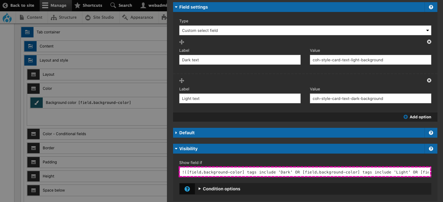
Within the Visibility area you will see a condition that must be met for the Text color field to be displayed. The condition checks to see if the color selected in the Background color field is NOT tagged with Light, Dark or Color. The NOT is achieved by using an exclamation mark before the condition. This reverses the condition logic.
Card border and border color
The cards include an option to apply a 1px border to the outer container of the card. If the content author chooses to add a border, they will be given the option to choose a border color. The Border color field only shows if the content author has selected 'Add border' in the Border field. This is achieved using conditional visibility on the Border color field.
Card automatic card padding
Padding will be applied around the content if a background color or border has been applied to the card. This will prevent the content from visually touching the edge of the card as this will look incorrect.
The padding is automatically applied using a hidden field with conditional visibility. To understand more, expand the Padding field group and open the settings of the hidden field called 'Conditionally apply padding if background color or border is set.'
Within the field, you will see that the value applies the custom style coh-style-padding-small, which applies padding to the card. You will also see the field will only be shown when a condition is met. The condition checks to see if the background color field is not Transparent or Undefined (in other words, that a background color has been applied) or that a Border has been applied. If the condition is true, the hidden field will apply the padding.
Manual card padding
If NO background color or border has been applied to the card a Padding field will be displayed so that the content author can choose to apply or remove the padding around the content. This is achieved using conditional visibility on the Padding field.
Card height
The cards include a Height field that allows the content author to set the minimum height of the card to one of two options:
- Fit to content - This makes the card shrink to the height of the content within it.
- Fill space available - This makes the card grow to the available space provided by where the card is place.
Both of these options use the Flex-item - Flex-grow property. This is important because it allows the card to adapt to its containing layout component. When Fill available space is selected, the card will grow in height but take into account other components that may have been placed within the same containing layout component. Using the flex:grow property only works in UIKit because the columns within the Layout components are display:flex and flex-direction:column. This makes the flex:grow property apply vertically rather than horizontally.
Using flex:grow is preferable over applying 100% height as it allows the cards to adapt to other components placed within the same layout column. 100% height would cause the cards to 'break out' of the containing column if multiple cards are stacked.
Add space below cards
All card components include an Add space below field. This adds a margin to the bottom of the card equal to the vertical gutters between each column. By default, the field is set to Add space below to provide visual separation between the cards when they are stacked on top of each other.