Adding interactivity to layouts
Use Slider, Accordion and Tab components to add interactivity to content and layouts. View the components available.
Adding Sliders to layouts
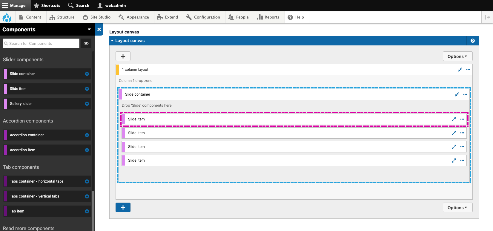
Use the Slider components to add Sliders (sometimes called carousels) to your Layouts. Sliders are created using two components that must be used together: The Slide container, which provides the navigation and pagination and the Slide item, which provides the individual slides. The Slide item must be placed directly within the Slide container. For each slide required, add an additional Slide item within the Slide container (As shown below). You will usually need to place the Slide container within a Layout component to restrict its width (As shown below).

Adding content to slides
Add content within the Slide item components. Most commonly you will add Layout components, Basic components, Card components and Map components into Slide items.
Setting the slides to show and scroll
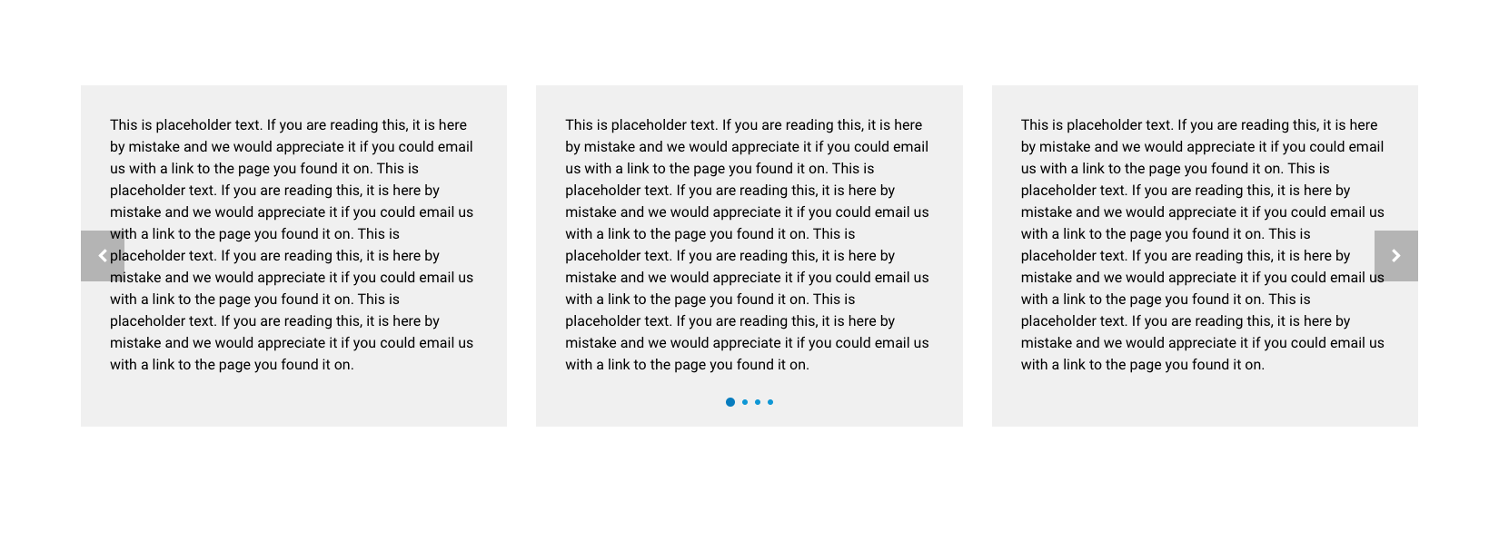
You can set the number of slides to show and the number of slides to scroll when the user interacts with the slider. Setting the number of slides to show will determine how wide each slide is. For example, setting the Slides to show to 1 will make each slide the Slide container's full width. Setting the Slides to show to 3 will make each slide 1/3 width of the Slide container (As shown below).


Adding Accordions to layouts
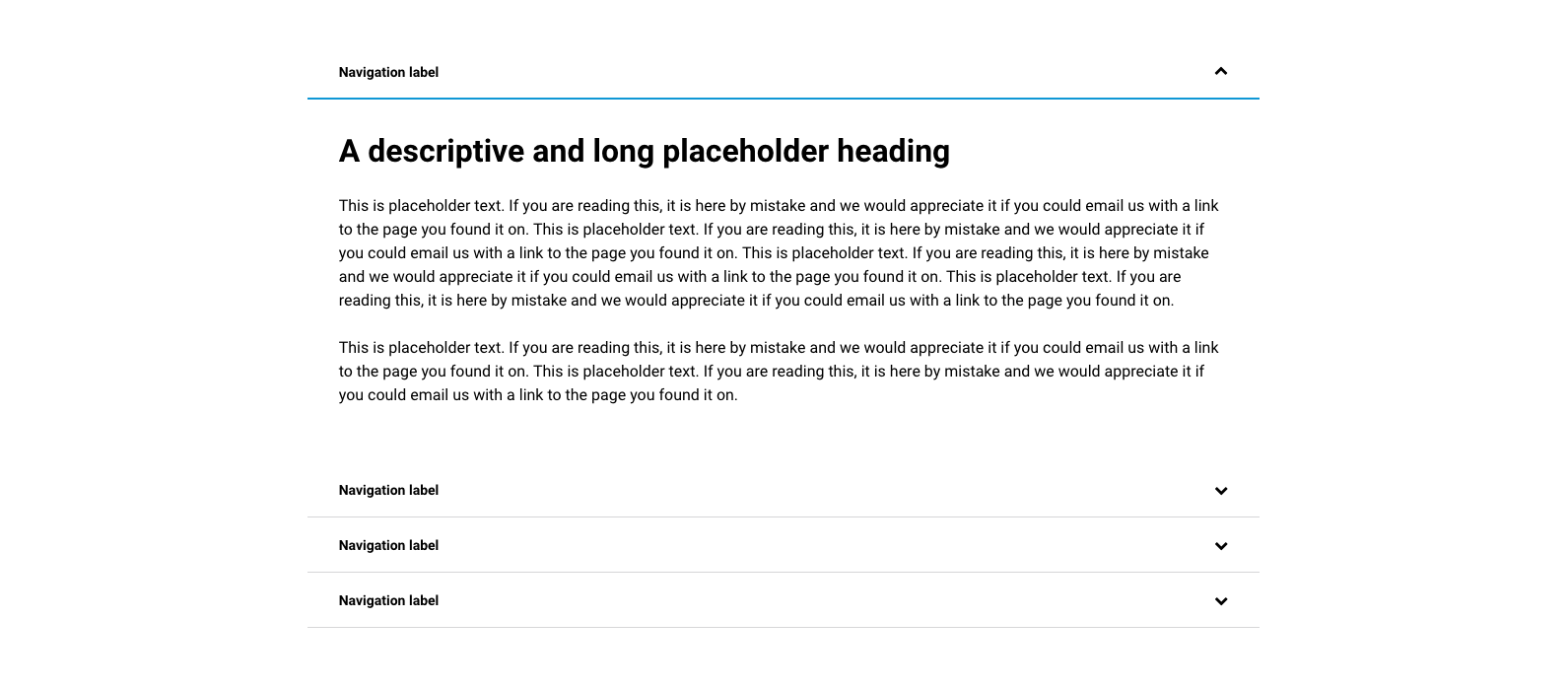
Use the Accordion components to add accordion-based content to your Layouts. Accordions are created using two components that must be used together: The Accordion container and the Accordion item, which provides the individual accordion navigation bars. The Accordion item must be placed directly within the Accordion container (as shown below). You will usually need to place the Accordion container within a Layout component to restrict its width (As shown below).


Adding Tabs to layouts
Use the Tab components to add tabbed based content to your Layouts. The UIKit provides two options for tabbed content. Horizontal tabs are displayed above the content and vertical tabs are displayed to the left of the content. With both horizontal and vertical tabs, the tabs convert into an accordion on smaller width screens.


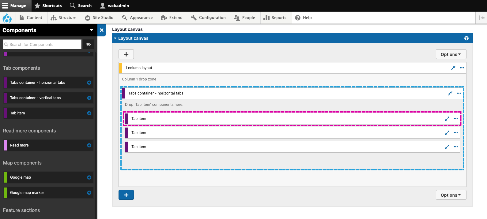
Tabs are created using two components that must be used together: The Tab container and the Tab item, which provides the individual tab's navigation buttons. The Tab item must be placed directly within the Tab container (as shown below). You will usually need to place the Tab container within a Layout component to restrict its width (As shown below).

Adding expandable content to layouts
Use the Read more component to add an expandable area of content to a layout. The Read more component can be used to provide teaser content with a Read more link to expand the full content (As shown below).

To create an expandable area of content, place the content that is always visible above the Read more components and the expandable content within the Rad more component (As shown below). You will usually need to place the Read more component within a Layout component to restrict its width (As shown below).


