
Components included in the Sections UIKit
The Sections UIKit includes a library of page section components that follow common website design patterns. The sections can be easy stacked, one upon the other to create rich content pages. Each section includes options to alter it's layout, background color and text colors.
Header and footer components
The UIKit includes a flexible header component with a configurable menu system and optional utilities bar. It also includes a footer component.
Header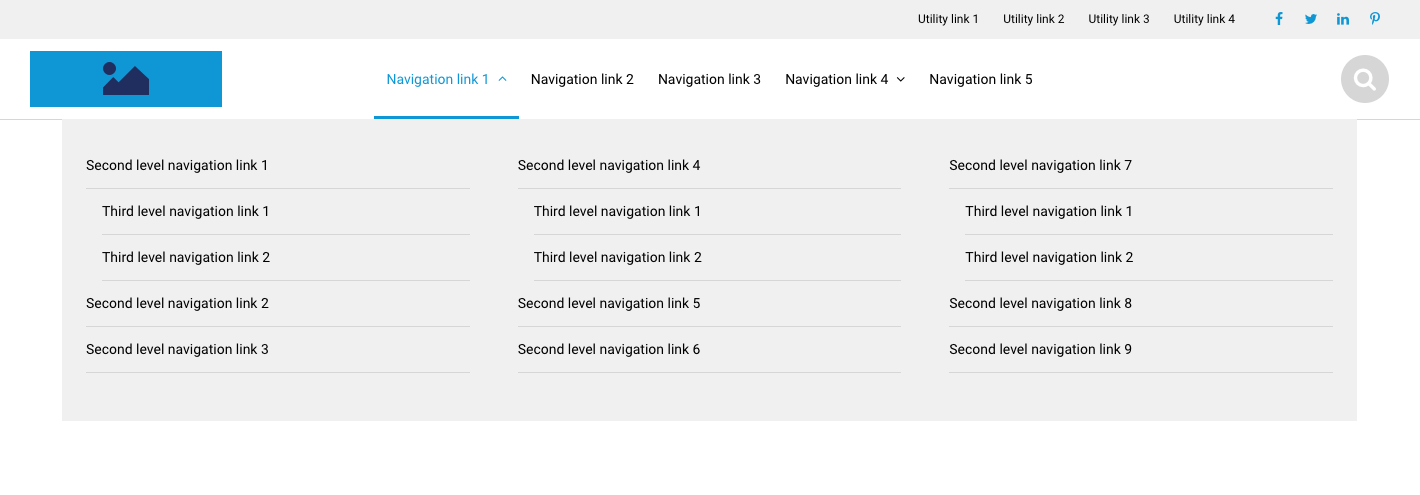
Footer
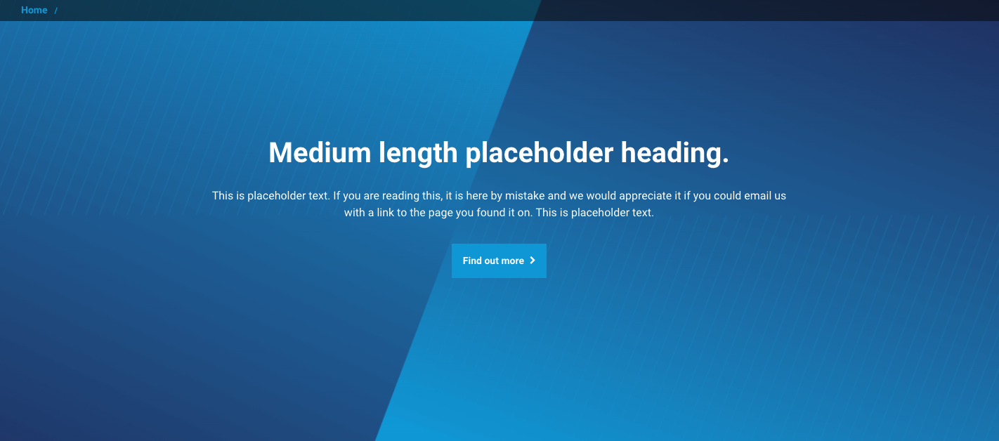
Featured sections
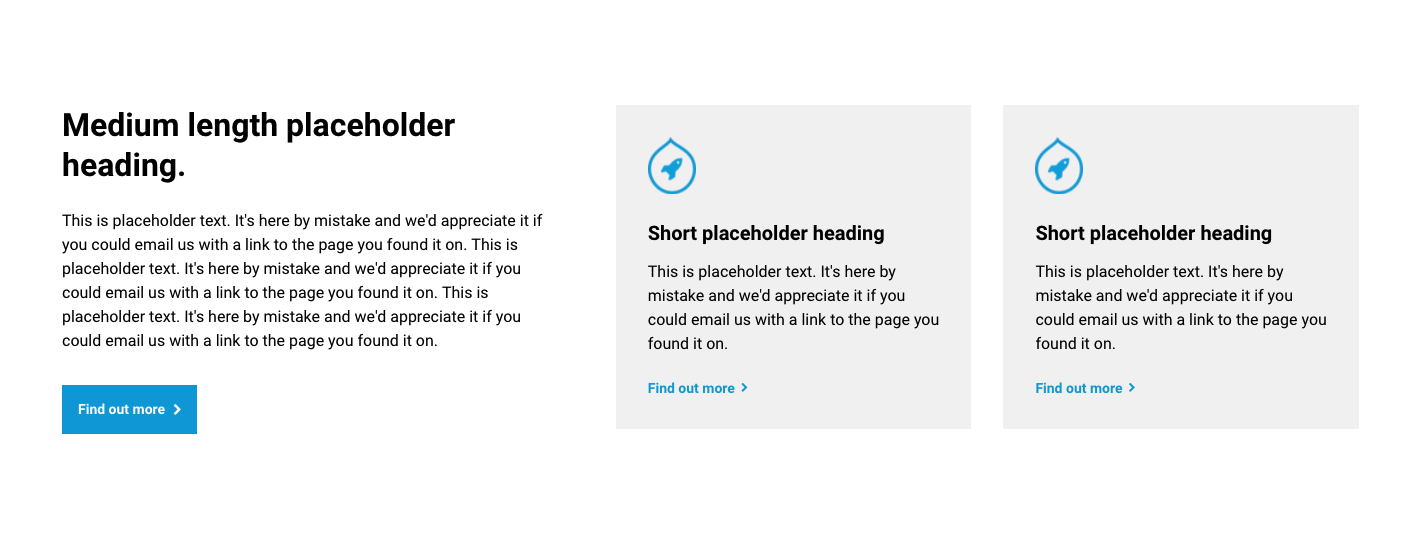
Hero component
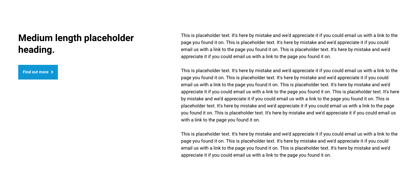
Text sections
Text section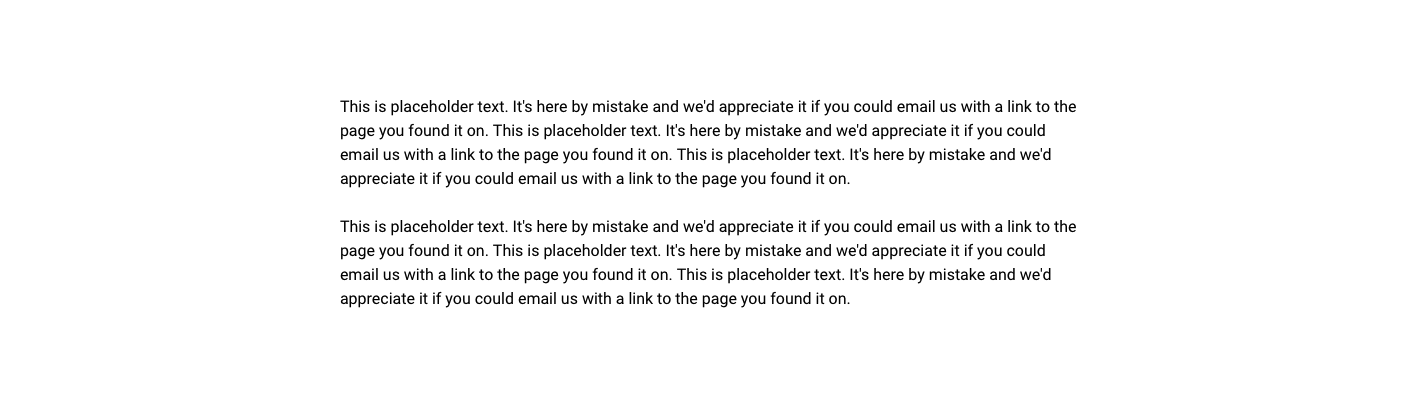
Text and text section
Expandable text section

Media sections
Text and media section

Text and wide image section

Text over background image section

Image section

Video section
Card sections
Text and card container section
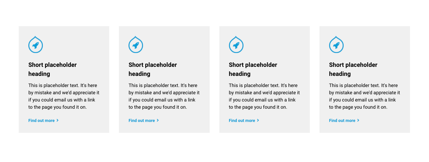
Use the Card container section to hold Card components. The image below shows an example of the Card container with nested feature card components.
Card container section
Use the Card container section to hold Card components. The image below shows an example of the Card container with nested feature card components.
Card components
Text card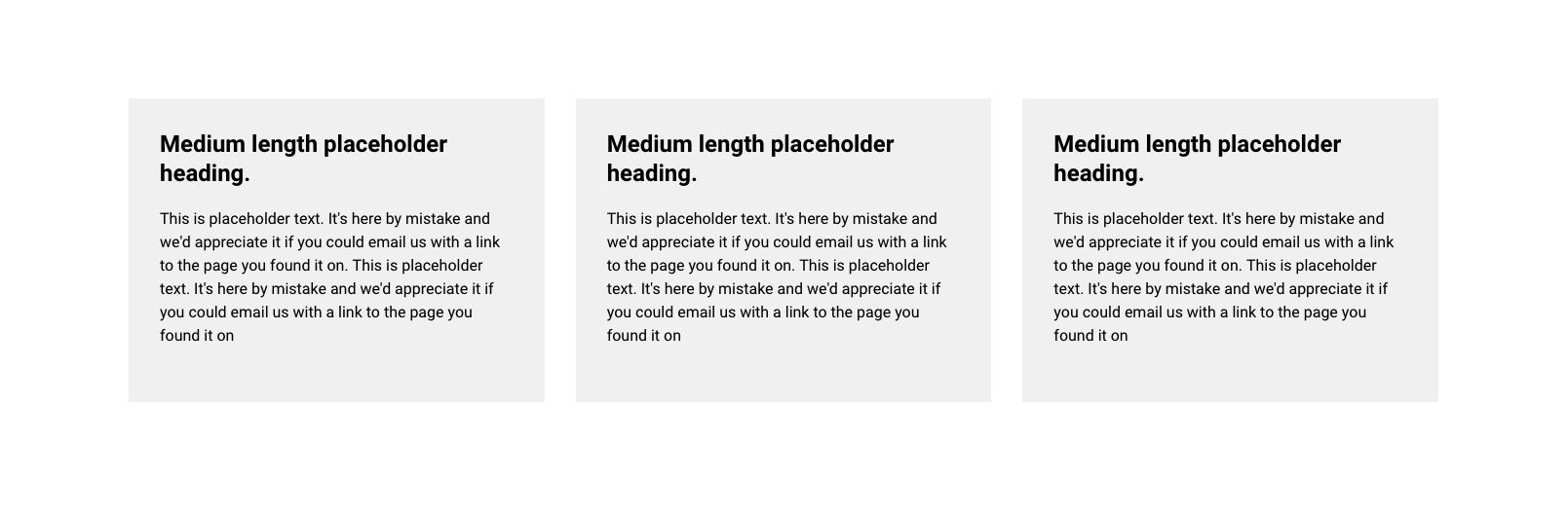
Image card

Feature card
Content card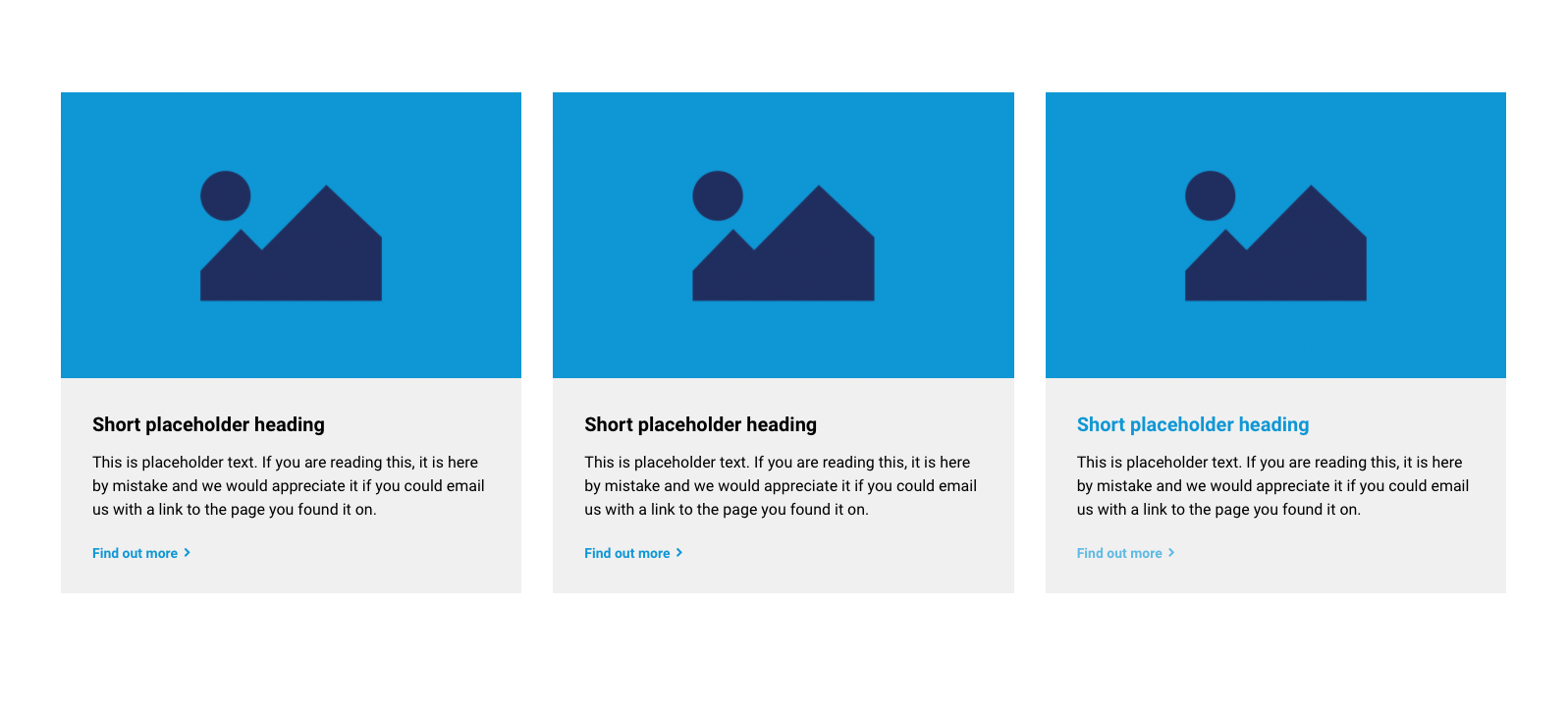
Horizontal content card
Impact card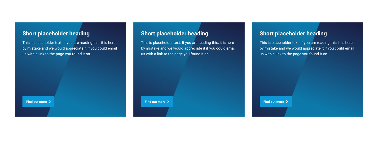
Price card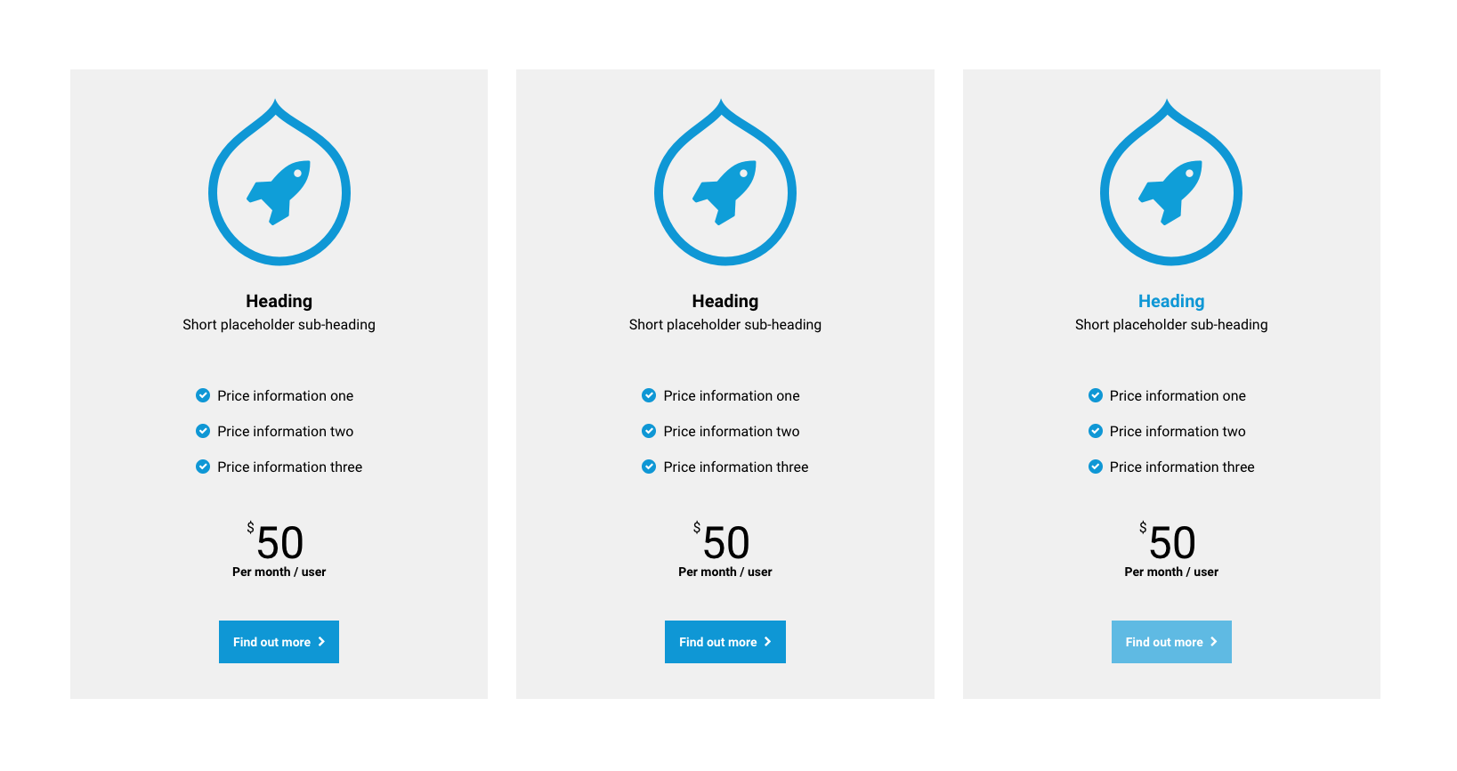
Profile card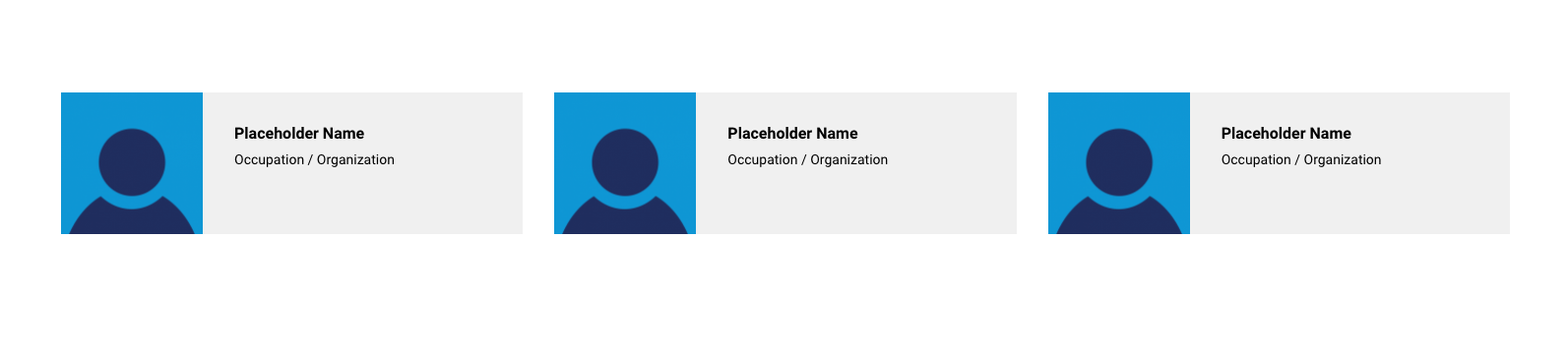
Testimonial card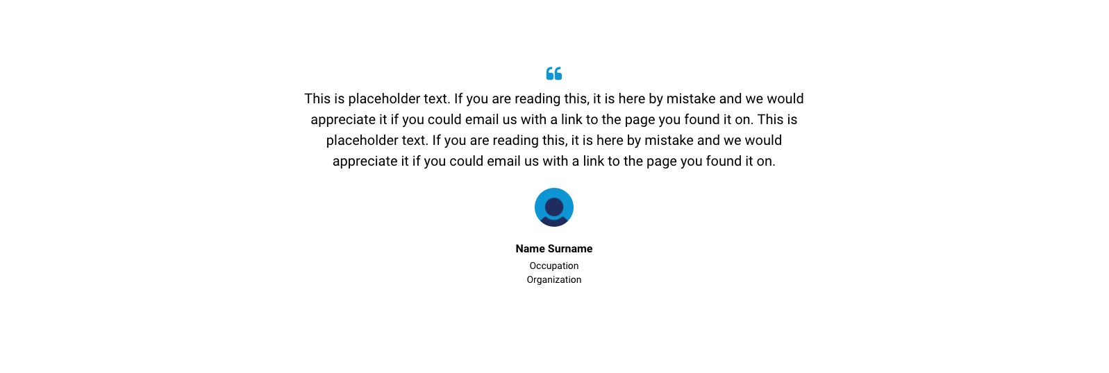
Logo card
Stat card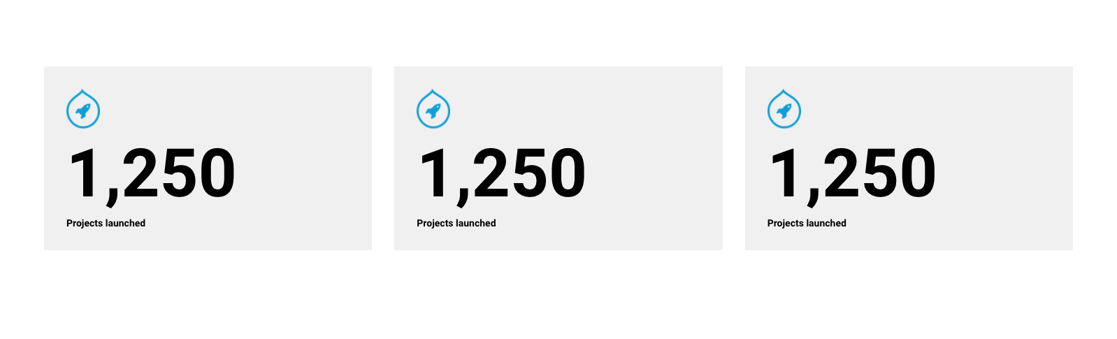
Accordion sections
Text and accordion section
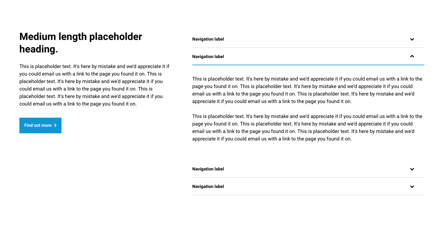
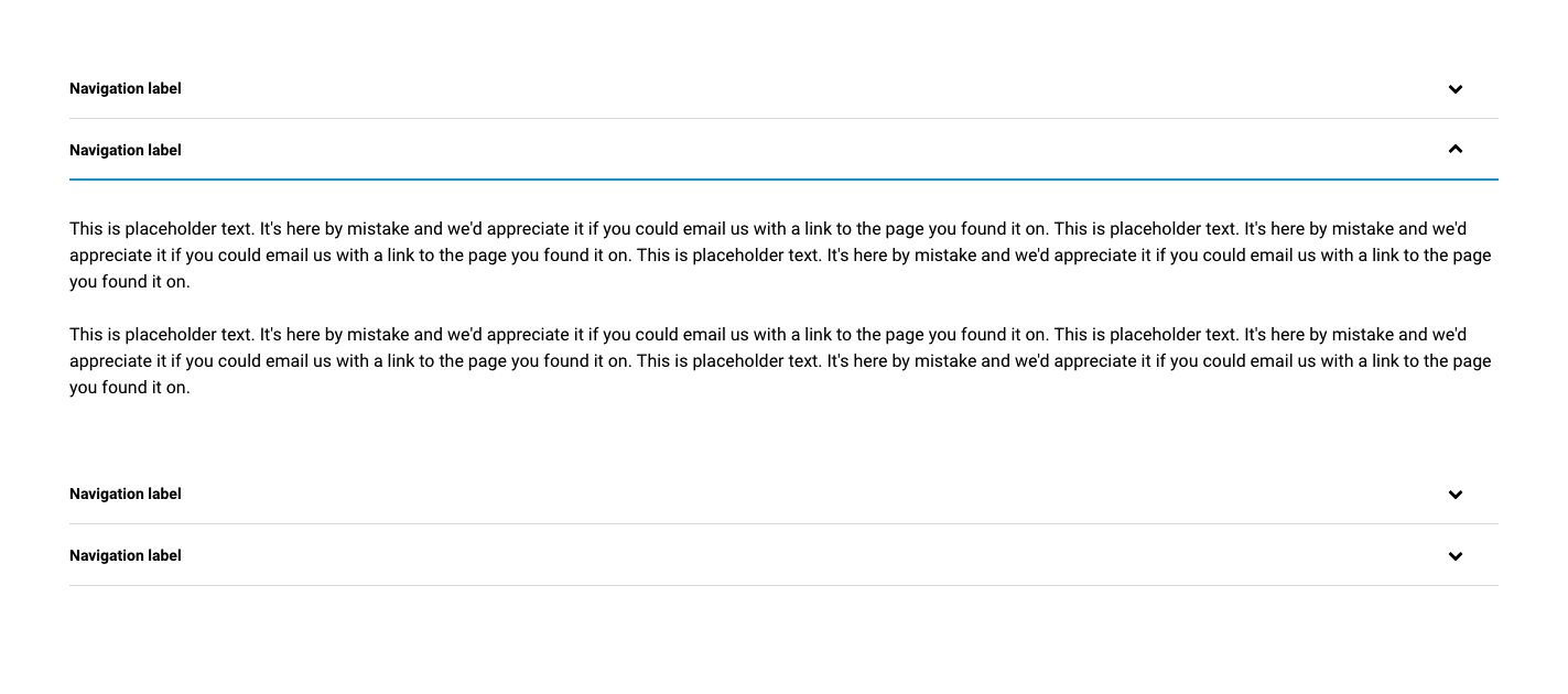
Accordion section
Tab sections
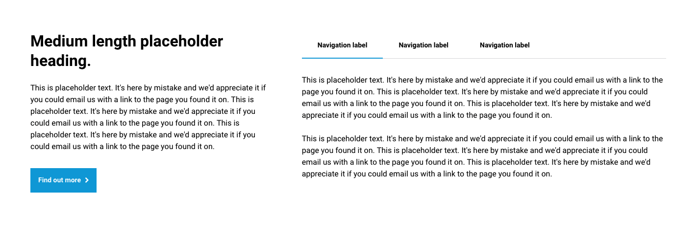
Text and tabs sections
Tabs section

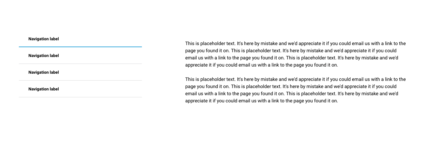
Vertical tabs section
Slider sections
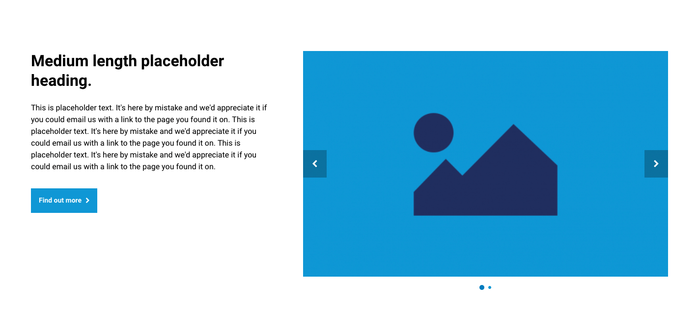
Text and slider section
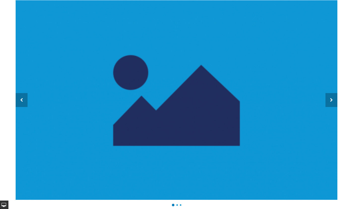
Slider section
Map sections
Text and map section
Map section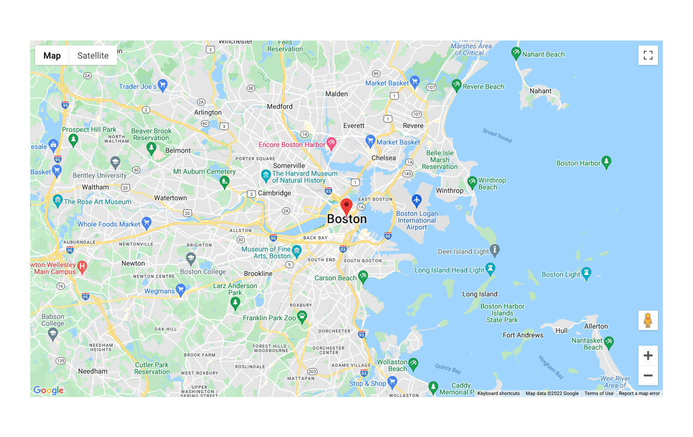