UIKit text component
The Text component provides a configurable block of rich text. It can be used for long text and as a text block with a background color.
Key information about this component:
Component form fields
Text editor
The text component includes CKEditor. The text format is set by default to Site Studio. This is because the Site Studio text format includes additional functionality that leverages the styles created within Site Studio. These are the Element styles and Inline styles menus. Using these menus, content authors can style content using Site Studios custom styles.
If there are styles included within these menus that you don't want editors using, you can disable access to individual styles within the Custom style user interface. To do this, navigate to the custom style you want to exclude, scroll to the bottom of the page and uncheck the Make available in WYSIWYG editor checkbox.
Background color and automatic text color
Content authors can change the background color of the text component using a Color picker field. When they select a color, a corresponding CSS class (custom style) is applied to the text component to style the text within it. For example, if Black is selected as the background color, a custom style is applied that styles the text white. This ensures the text contrasts with the background color.
This is achieved using hidden fields that are conditionally applied to the text component when a background color is selected. To understand more:
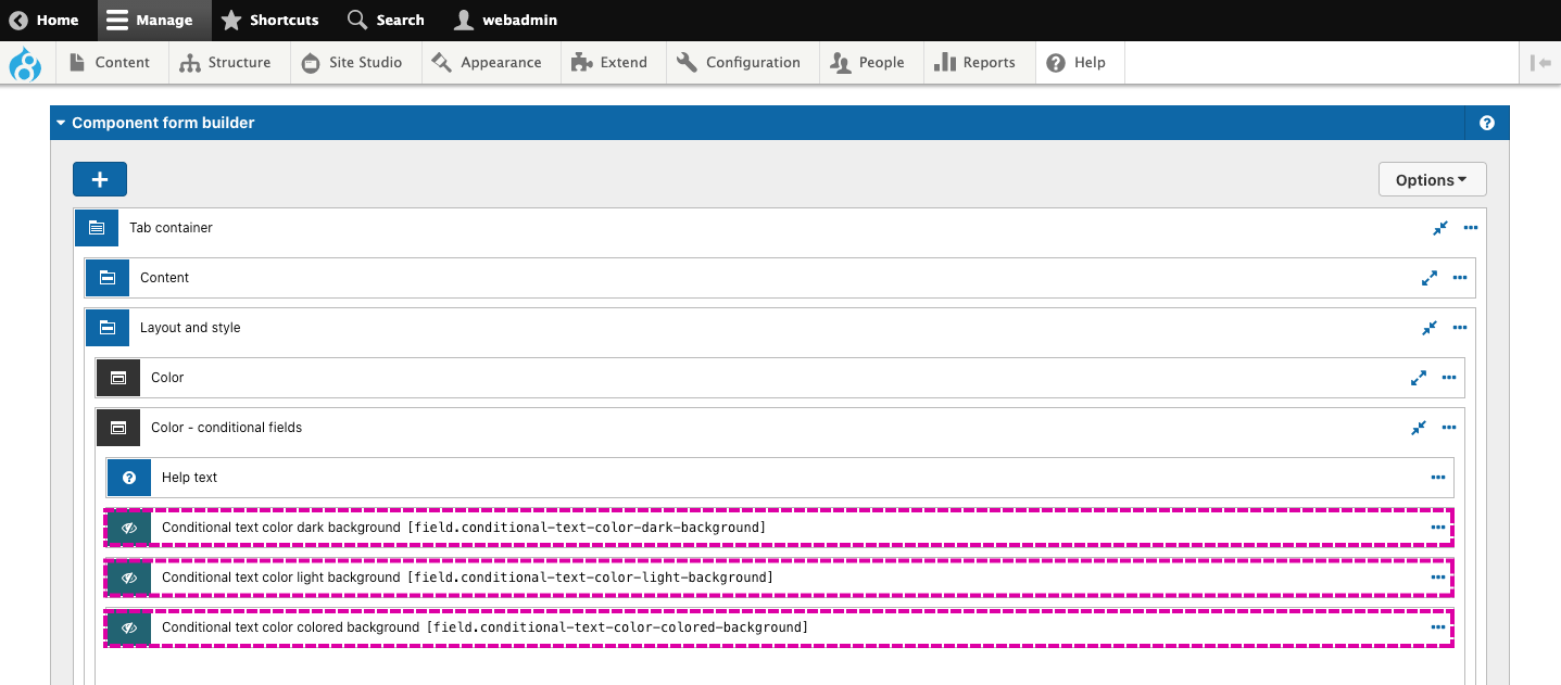
- Open the Text component and scroll to the Component form builder.
- Then expand the Layout and style tab and then expand the Color - Conditional fields area. Within this, you will find three Hidden fields.

Each of the hidden fields will apply a different custom style to the component. The hidden field applied depends on the background color selected and if it has been tagged with Light, Dark, or Color.
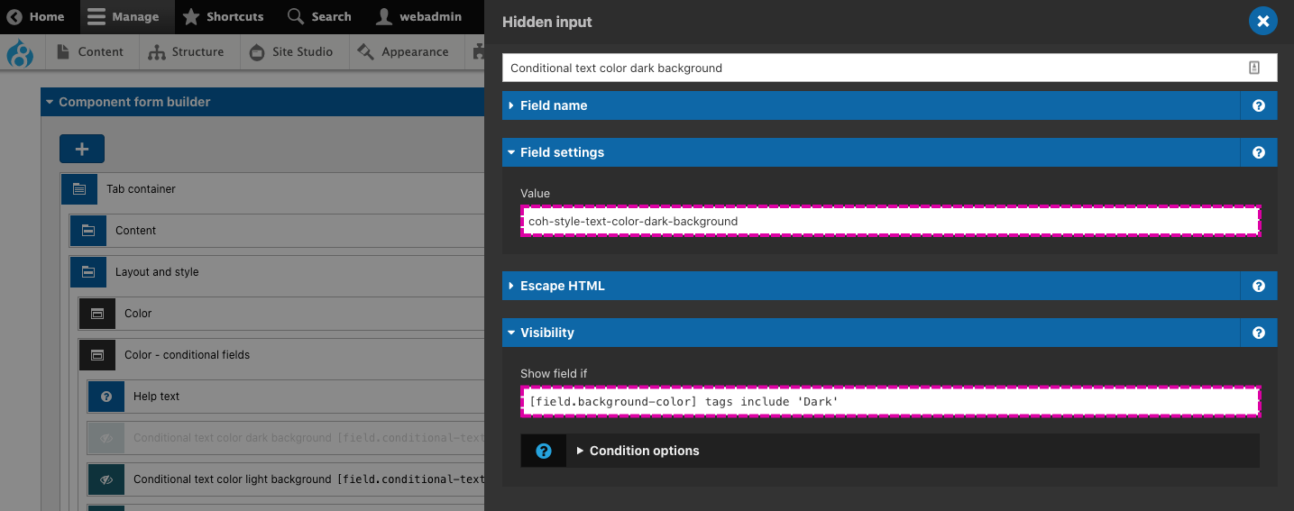
This is achieved using a condition on the Hidden field. To understand more, open the settings for the first hidden field. Within the settings you will see the value is a CSS class - .coh-style-text-color-dark-background. This will apply a style that makes the text light to contrast with a dark background if selected.
Below this, within the Visibility section you will see a condition that must be true for the hidden field value to be applied. This is [field.background-color] tags include 'Dark'. If we translate this condition it says "The value of the field 'background color' must be tagged with Dark." If this is true, the hidden field value will be applied.

The same logic applies to all three hidden fields. Each hidden field applies a different custom style when its visibility condition is true.
Background color and manual text color
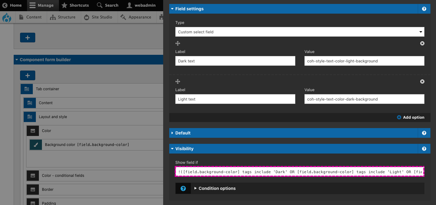
Suppose a content author selects no background color, transparent background color, or a color that hasn't been tagged with Light, Dark, or Color. In that case, the content author will be provided a dropdown select to select an appropriate text color style manually. This is achieved using conditional visibility on the Text color field. To understand more, expand the Color field group and open the settings for the Text color field (shown below).

Within the Visibility area, you will see a condition that must be met for the Text color field to be displayed. The condition checks to see if the color selected in the Background color field is NOT tagged with Light, Dark or Color. The NOT is achieved by using an exclamation mark before the condition. This reverses the condition logic.
Border and border color
The Text component includes an option to apply a 1px border to the outer div of the component. If the content author chooses to add a border, they will be given the option to choose a border color. The Border color field only shows if the content author has selected 'Add border' in the Border field. This is achieved using conditional visibility on the Border color field.
Automatic padding
Padding will be applied around the text content if a background color or border has been applied to the component. This will prevent the content from visually touching the edge of the component as this will look incorrect.
The padding is automatically applied using a hidden field with conditional visibility. To understand more, expand the Padding field group and open the settings of the hidden field called 'Conditionally apply padding if background color or border is set.'
Within the field, you will see that the value applies the custom style coh-style-padding-small, which applies padding to the component. You will also see the field will only be shown when a condition is met. The condition checks to see if the background color field is not Transparent or Undefined (in other words, that a background color has been applied) or that a Border has been applied. If the condition is true, the hidden field will apply the padding.
Manual padding
If NO background color or border has been applied to the component, a Padding field will be displayed so that the content author can choose to apply or remove the padding around the content. This is achieved using conditional visibility on the Padding field.
Height
The Text component includes a Height field that allows the content author to set the minimum height of the component to one of two options:
- Fit to content - This makes the component shrink to the height of the content within it.
- Fill space available - This makes the component grow to the available space provided by where the component is place.
Both of these options use the Flex-item - Flex-grow property. This is important because it allows the component to adapt to its containing layout component. When Fill available space is selected, the component will grow in height but take into account other components that may have been placed within the same containing layout component.
Using the flex:grow property only works in the UIKit because the columns within the Layout components are display:flex and flex-direction:column. This makes the flex:grow property apply vertically rather than horizontally. Using flex:grow is preferable over applying 100% height as it allows the component to adapt to other components placed within the same layout column. 100% height would cause the component to 'break out' of the containing column if multiple components are stacked.
Add space below
The text component includes an Add space below field. This simply adds a margin to the bottom of the component that is equal to the vertical gutters between each column. This setting provides visual separation between the component and other components when they are stacked on top of each other.
Text columns
The Text component includes the option to divide the text into multiple columns. This option uses the CSS multi-column layout. The content author has the option to divide the text into 2 or 3 columns. The columns will merge back into a single column at the Tablet breakpoint.

