UIKit helpers for common layouts
The UIKit includes a library of ‘Helpers,’ which combine the components into common layouts. The Helpers get you building quickly and demonstrate how to combine components to form layouts.
Hero sections
Basic hero
Shallow hero
Hero with image right of text
Hero with image below text
Text sections
Heading section center aligned
Heading section left aligned
Text section
Text panel over image section
Accordion text section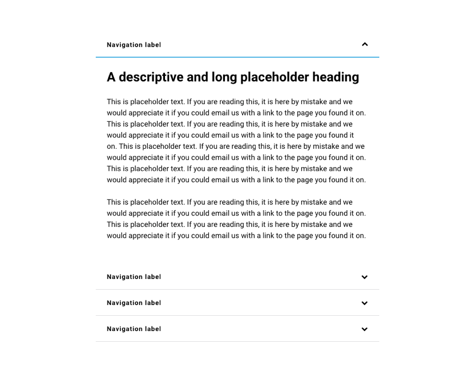
Multi-column text section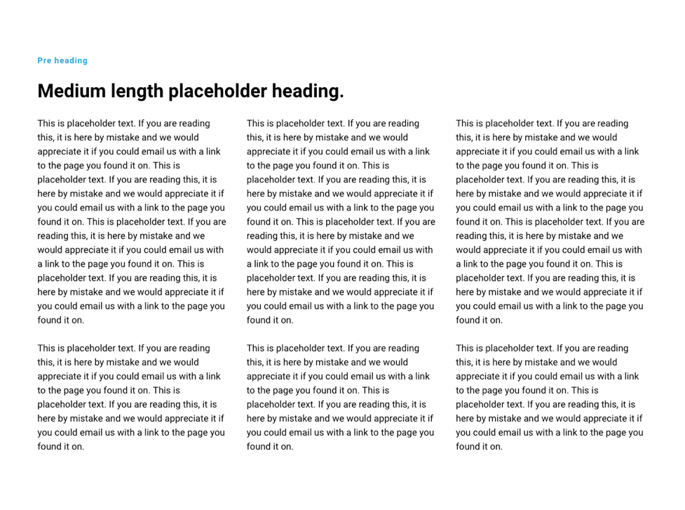
Text with expandable read more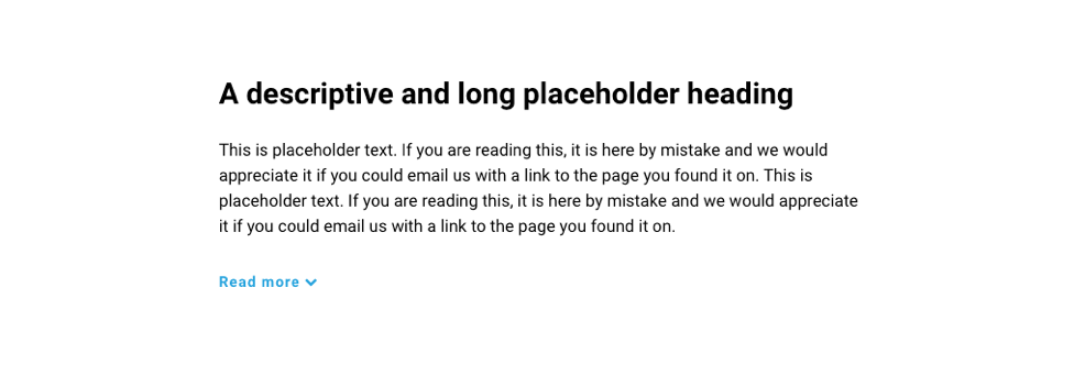
Text and image
Text and image slider
Text and features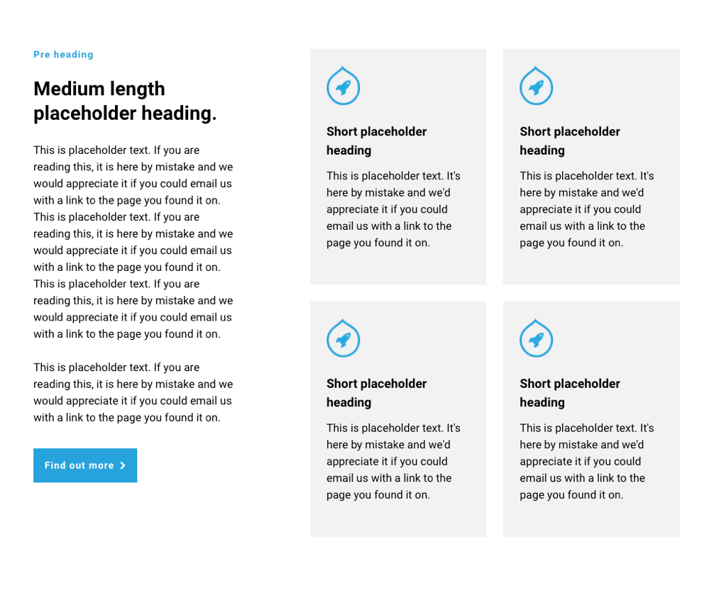
Text and content cards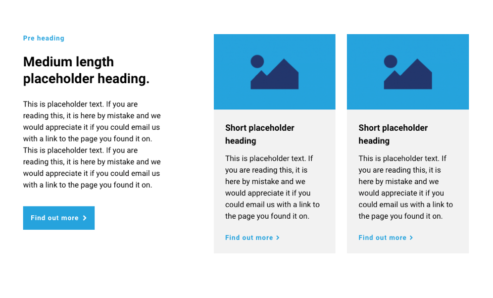
Text and content card slider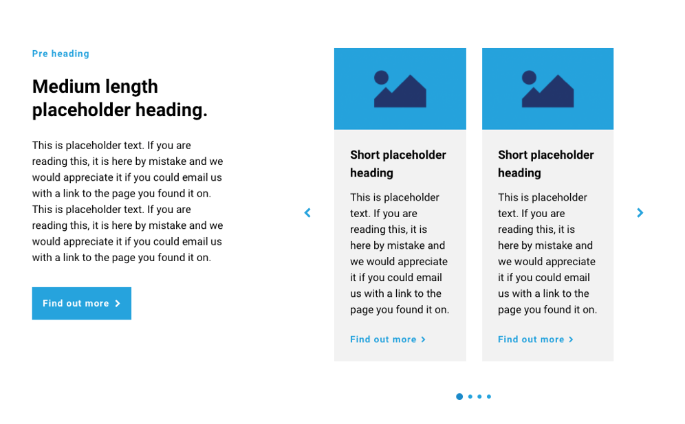
Text and price cards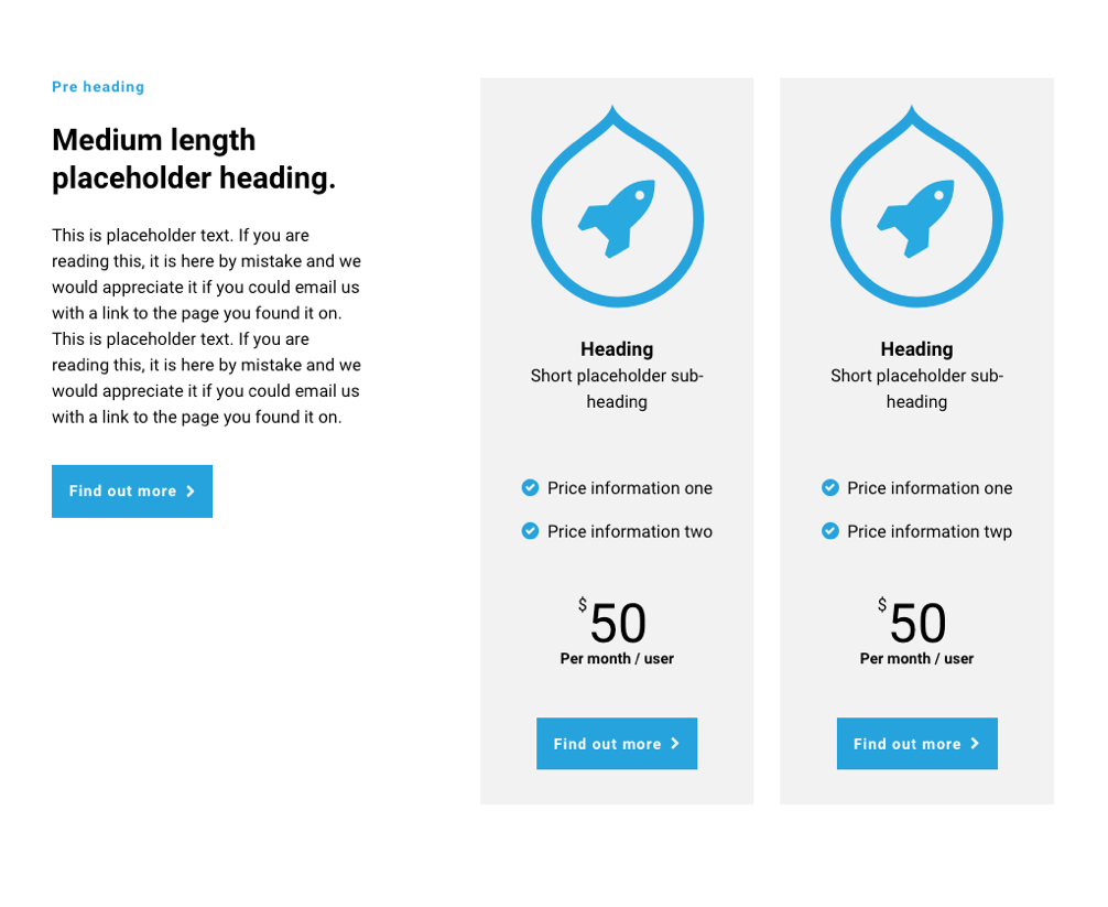
Text and profile cards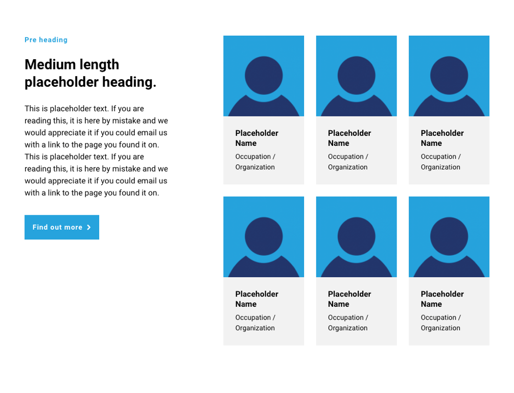
Text and stats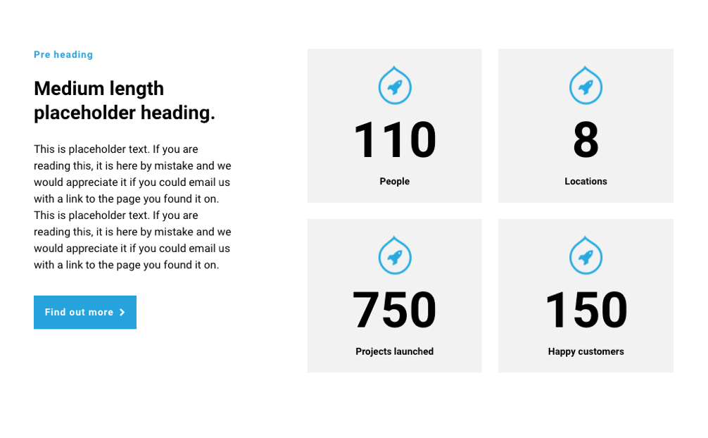
Text and map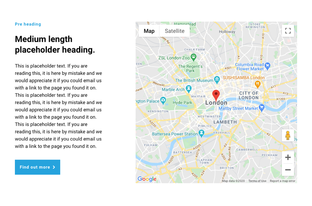
Text and accordion
Card sections
Content card section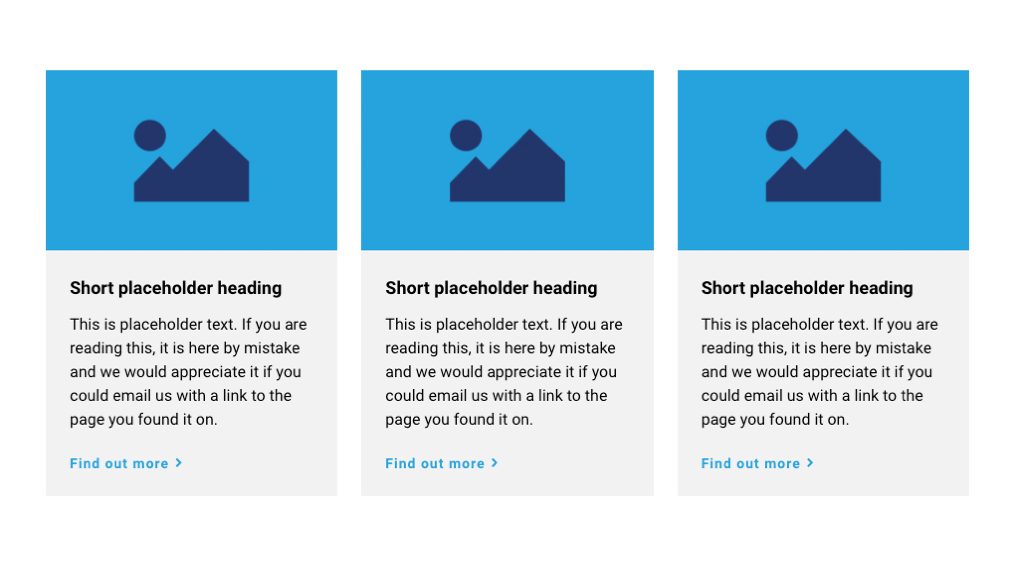
Logo card section
Price card section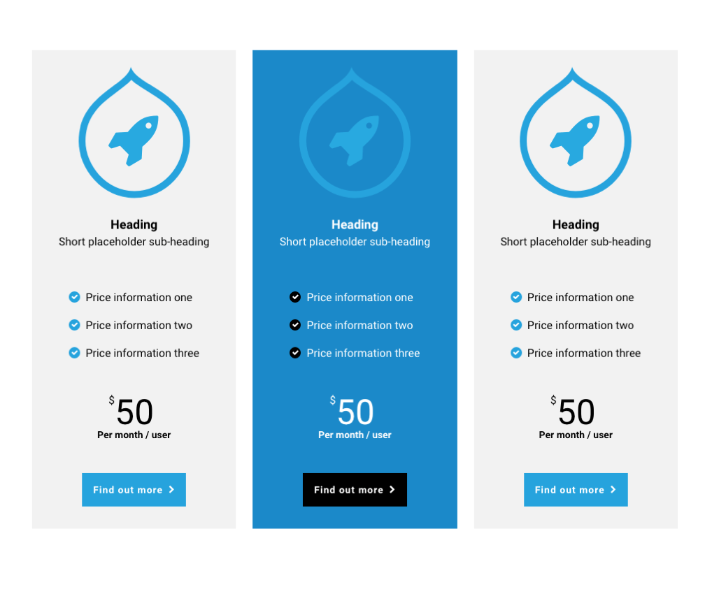
Feature card grid
Irregular feature card grid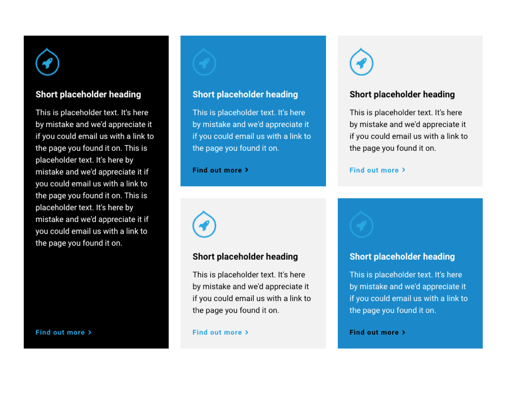
Impact card section
Irregular impact card grid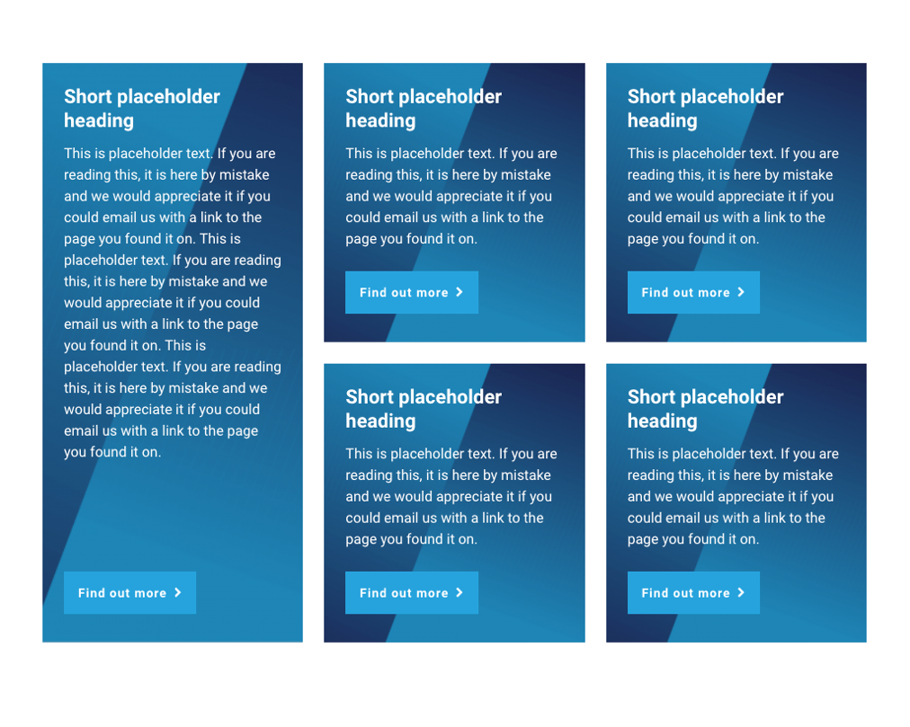
Tabbed content sections
Horizontal tabs section
Vertical tabs section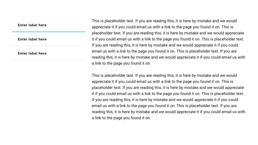
Slider sections
Content card slider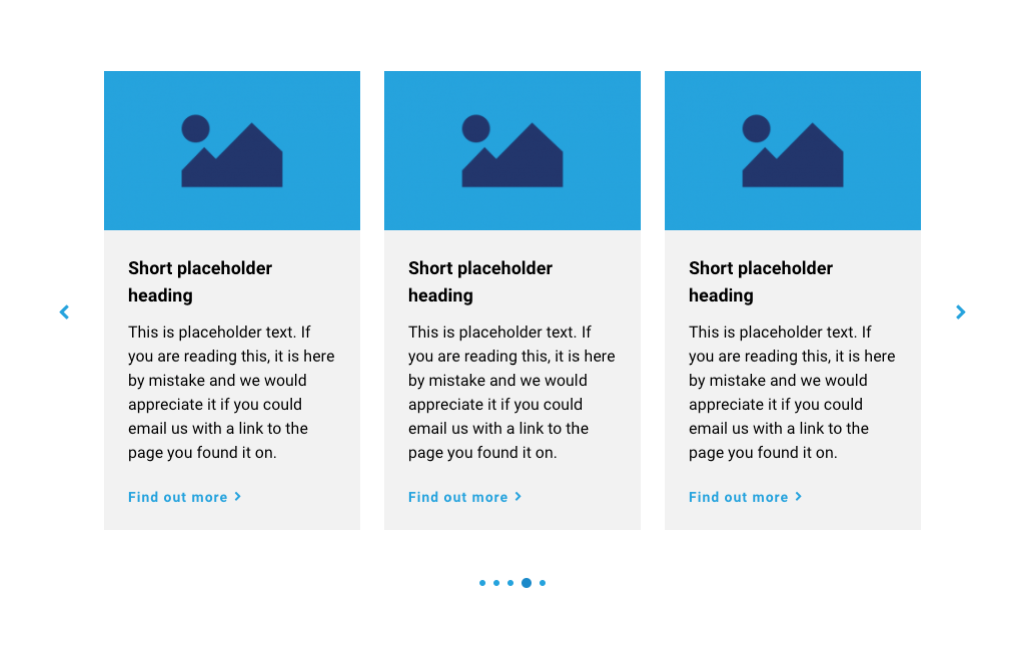
Profile card slider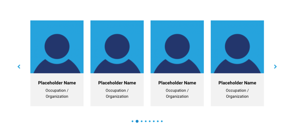
Testimonial slider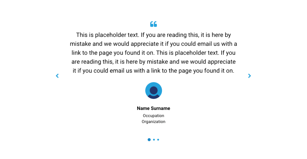
Miscellaneous
Call to action section
Image grid section
Full bleed image grid section

