Creating sections with nested card components
The UIKit include two section components that can contain nested Card components. These are the Text and card container section and the Card container section.
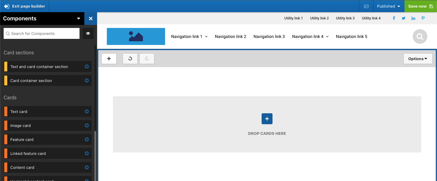
To use these sections, first drag one onto your page. The visual below shows the Card container section added to the page. You will see that it includes a drop zone for adding cards.
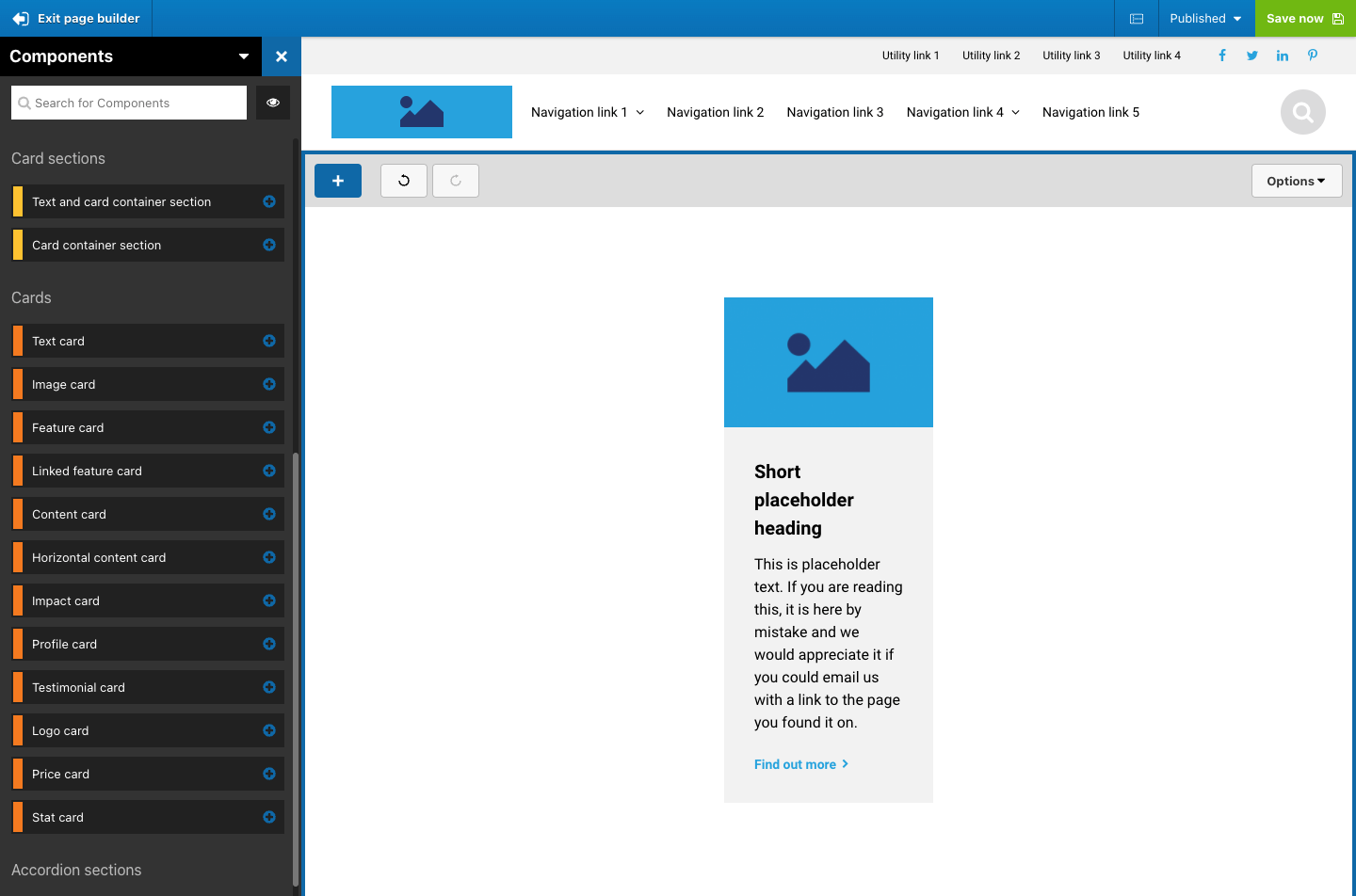
Then drag a card into the drop zone. The visual below shows a Content card added to the drop zone.
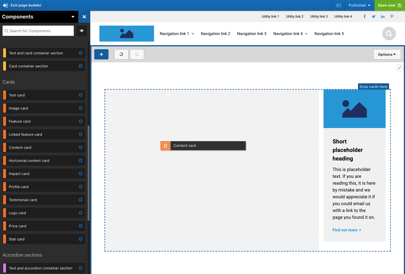
To add another card, drag it into the approximate area of the first card. You will see the border of the drop zone is displayed and a grey placeholder which indicates where the card will be placed.
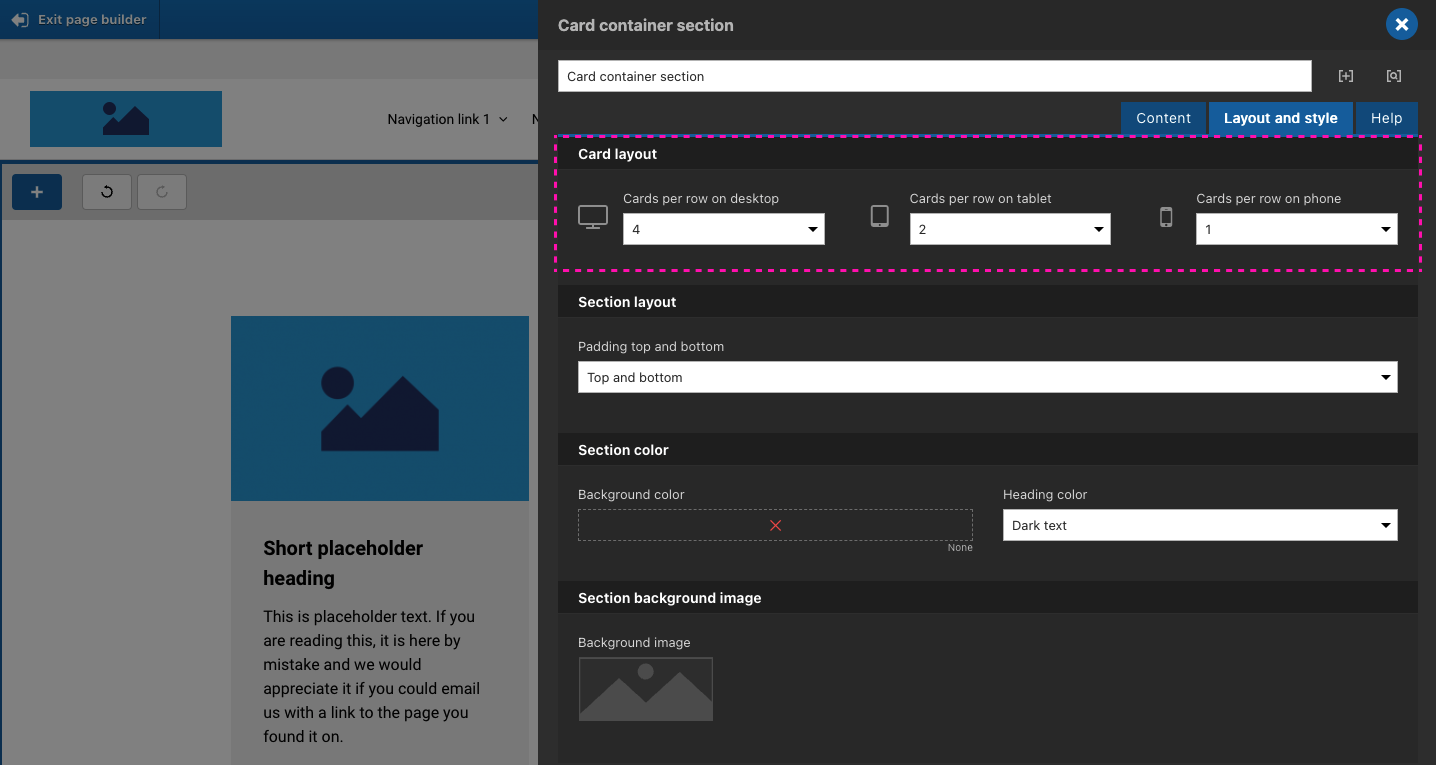
Once placed, you can change the number of cards shown in each row of the Card container.
- Open the settings of the Card container
- Click on the Layout and style tab
- Within the Card layout section of the form, select the number of cards you want to show in each row.
- Click Apply.
The setting is available for each device width so that you can adjust the number of cards to show in each row by device.
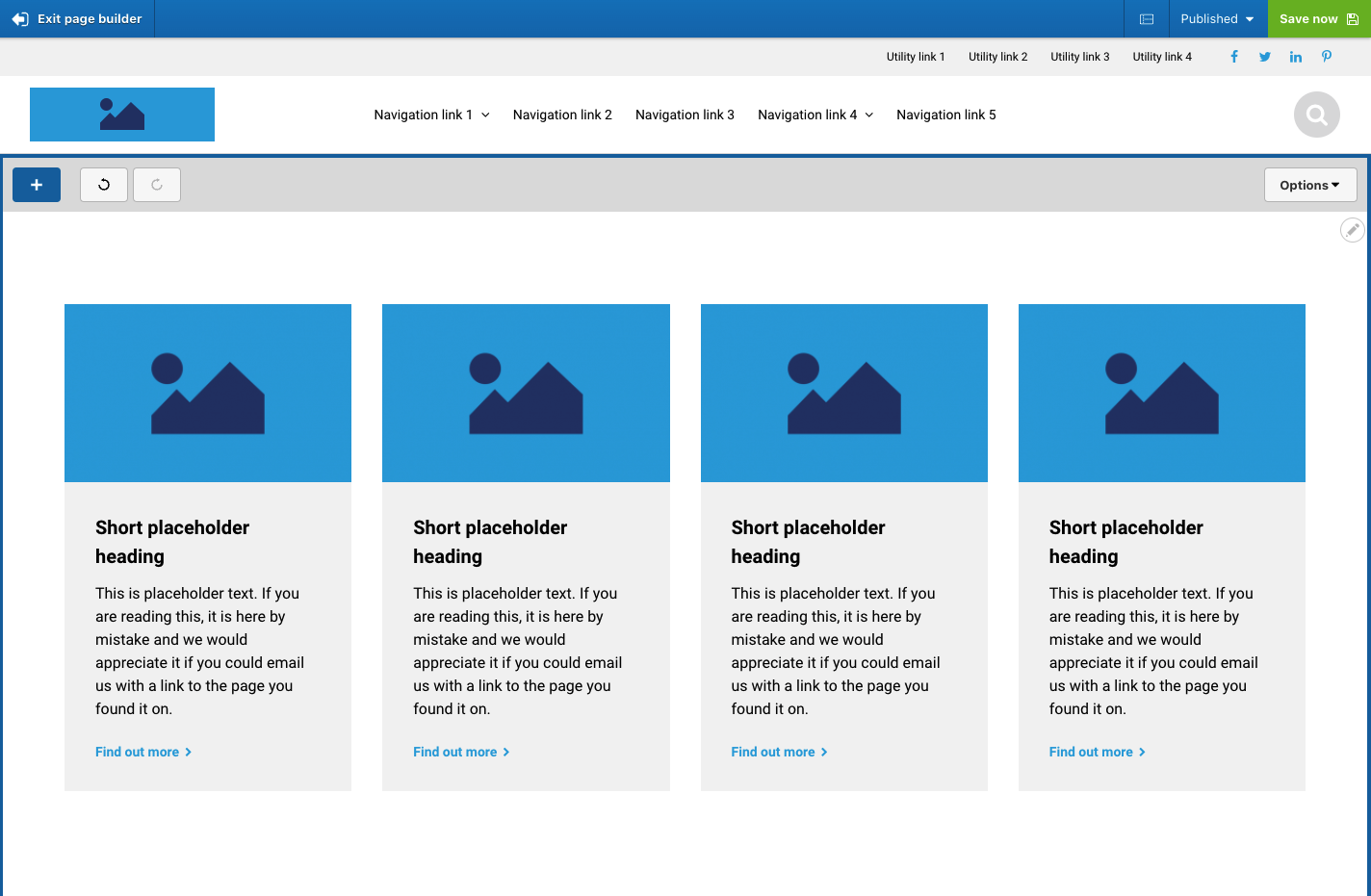
Setting the Card section to 4 cards per row on desktop would result in the following layout.
