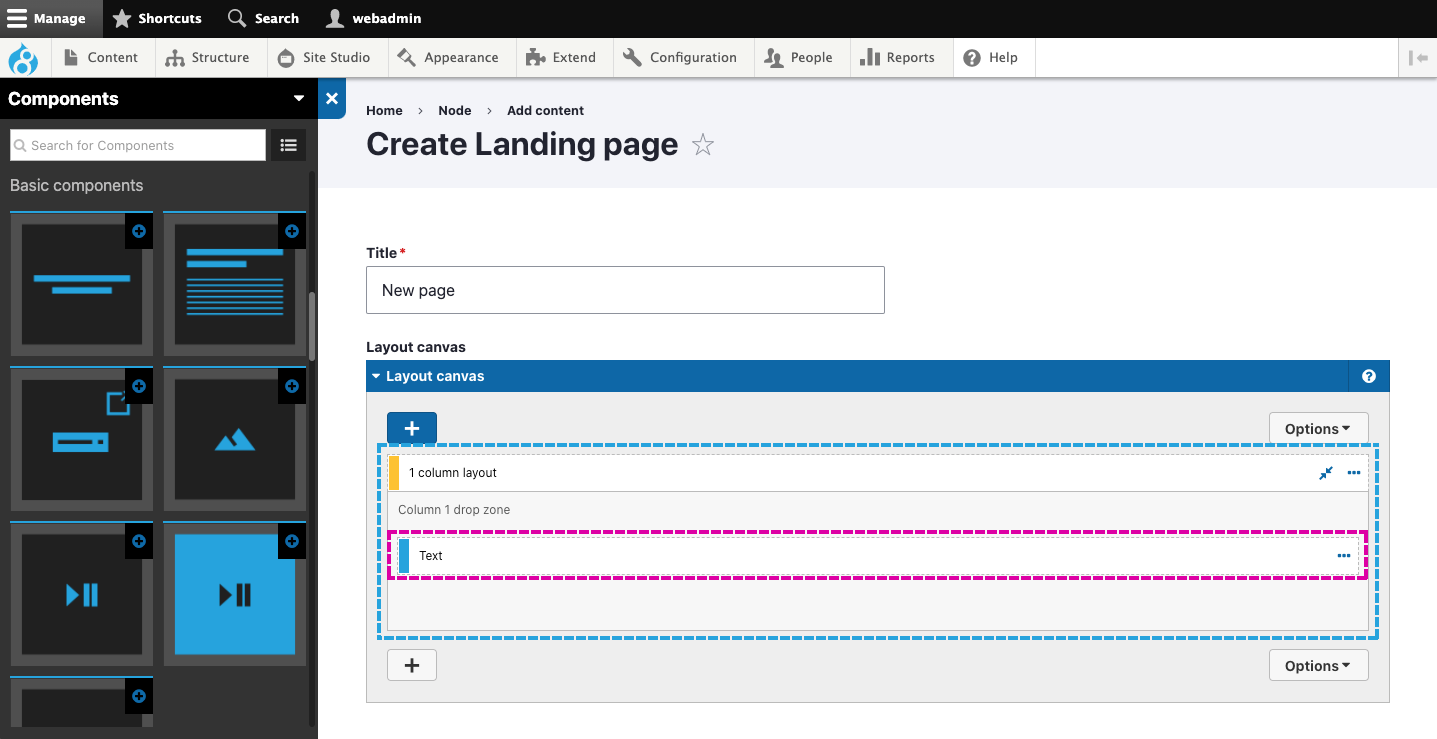
Adding basic content to layouts
Use Basic components to add content to the layouts. The Basic components include common content formats including text, images, video, audio and links. To access the Basic components, open the Sidebar and scroll to the Basic components category. View the Basic components available.
Placing Basic components within layouts
Basic components are designed to be placed within containing components. These include the 1 - 4 column layouts, Column, Container, Slide item, Accordion item and Tab item components. When placed, they will expand to fill the available width of the containing component. This means they’re adaptable for many different layout configurations.

It's essential always to place a Basic component within a containing component to restrict its width. For example, To create a section of text, place the Text component within a 1 column layout component (as shown above) to set the column's width and position. This will make the text within it easier to read. If you don't place the Text component within a 1 column layout component, it will expand to your screen's width, making it look incorrect and difficult to read (as shown below).

Basic component options
The Basic components all include options that are unique to each component, all of which are detailed within the Help tab of each component.
An important setting to understand which is shared across the Basic components is Add space below. Add space below allows you to add a space (margin) below the component. This is often required when placing components on top of each other and for when the components stack in a single column on phones. When placing Basic components within layouts, you will often need to decide to add space below or not.

