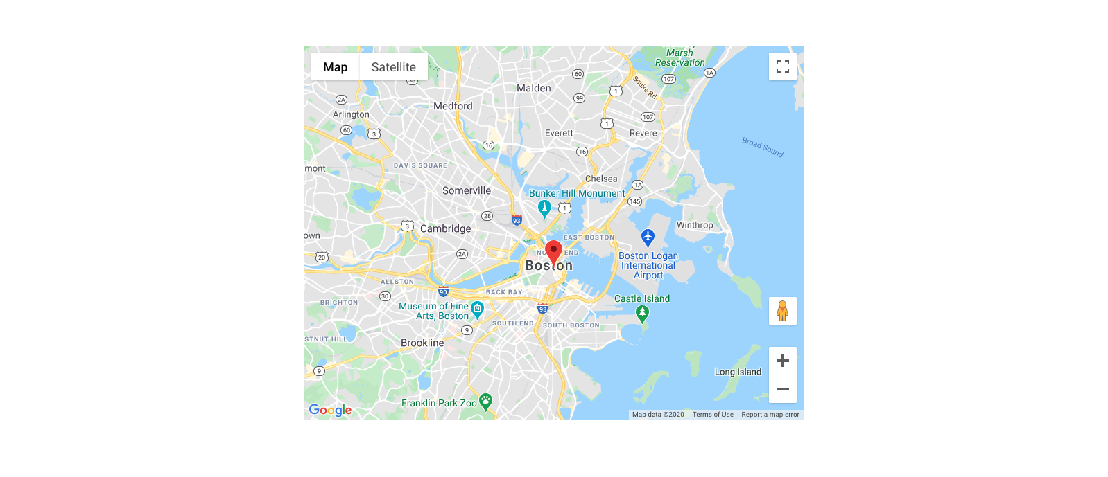
Components included in the UIKit
The UIKit includes a library of components that can be combined in almost infinite combinations to create the content and layout your site needs. In addition to the components shown below, the UIKit includes a library of 'Helpers,' which combine the components into common website patterns. See the Helpers included.
Header and footer components
The UIKit includes a flexible header component with a configurable menu system and optional utilities bar. It also includes a footer component.
Header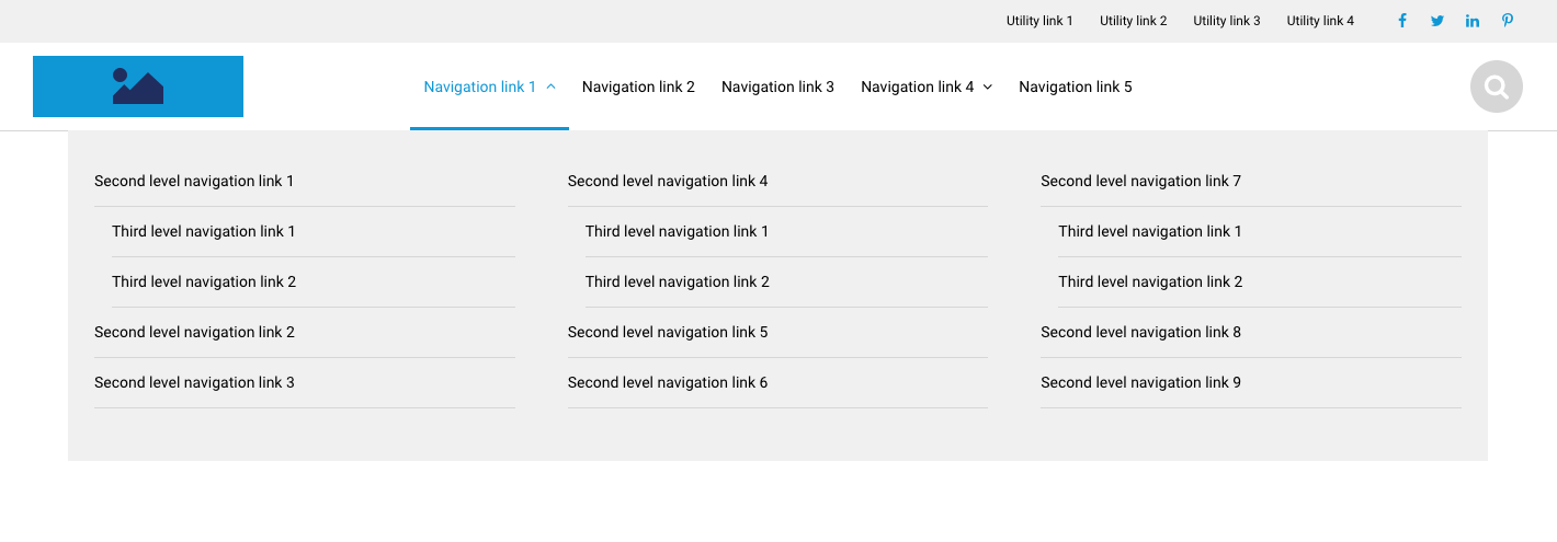
Footer
Layout components
Layout components provide the structure of your pages. Each component includes configuration options, some examples of which are shown below.
1 column layout component
Configuration examples
2 column layout component
Configuration examples
3 column layout component
Configuration examples
4 column layout component
Custom layouts with Row and Column component
Divider line component
Modal component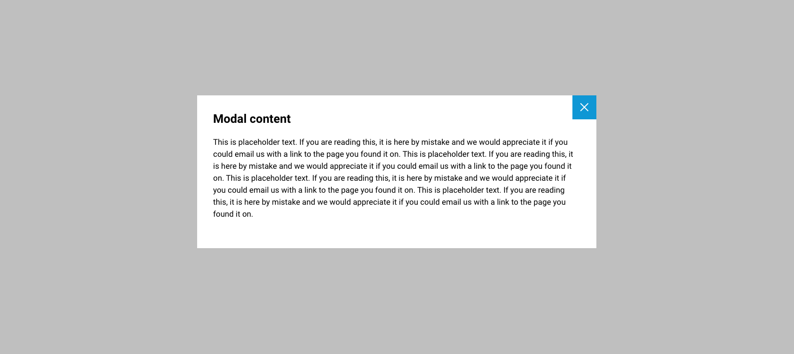
Basic components
Heading component
Text component
Image component
Video component
Audio component
Buttons component
Card components
Feature card
Content card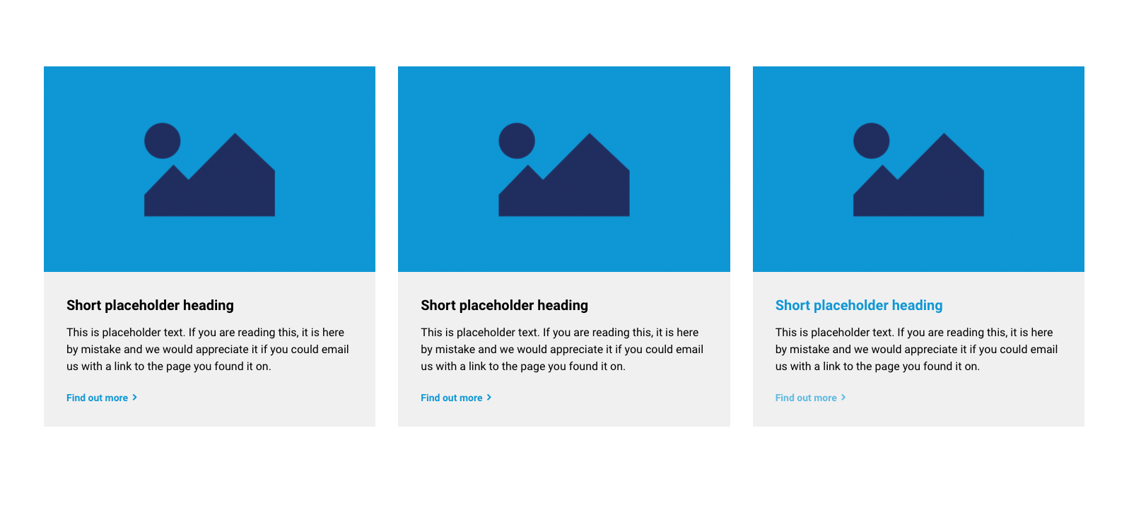
Horizontal content card
Impact card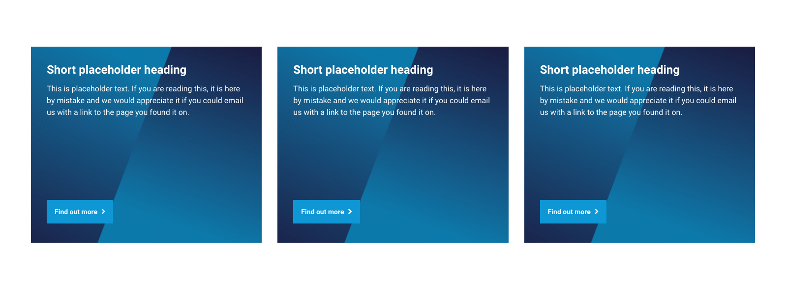
Price card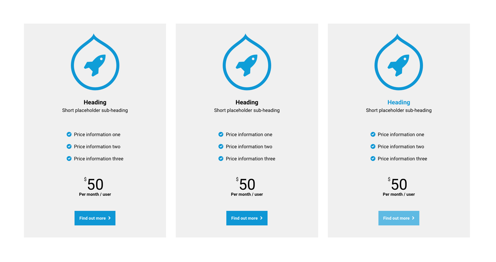
Profile card
Block quote card
Testimonial card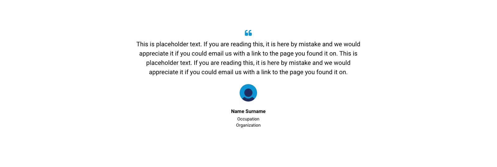
Logo card
Stat card
Social links card
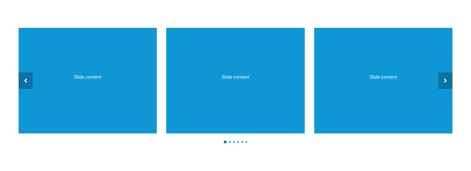
Slider components

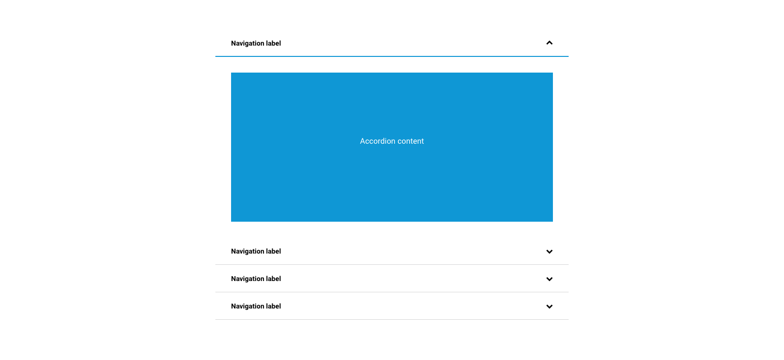
Accordion components
Tab components
Horizontal tabs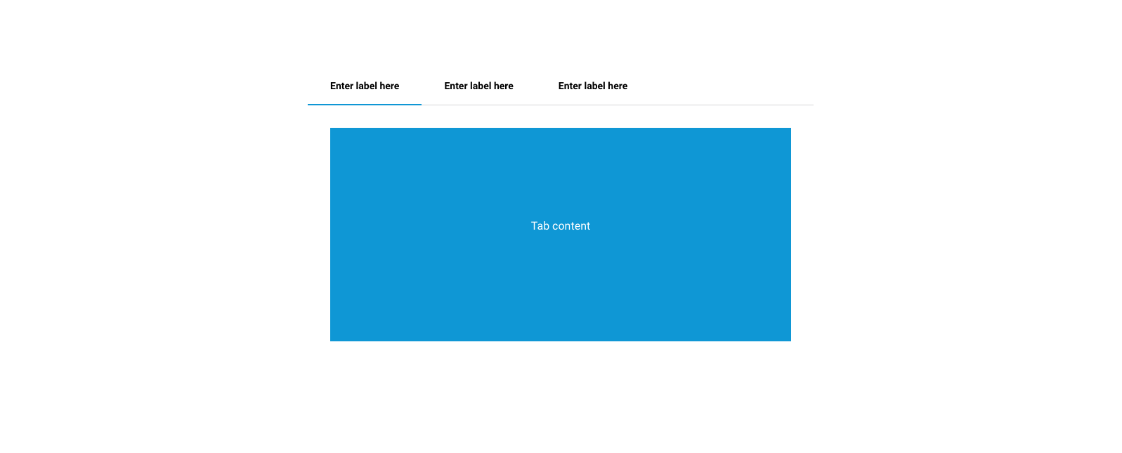
Vertical tabs
Read more components

Map components
